Opening the book…
Work, exchange, and technology
From the silver used to make colonial sugar bowls to the steel used in submarines—how work, exchange, and technology have shaped the United States.
“What a fascinating modern age we live in”
Essay by Dr. Bryan Zygmont
In the film Master and Commander: The Far Side of the World, set during the Napoleonic Wars, Captain Jack Aubrey (played by Russell Crowe) describes the engineering of a French ship: “Bluff above the water and sharp below….That’s why she’s so fast. Heavier, but fast despite it. That’s the future. What a fascinating modern age we live in.”
This brief cinematic quote underlies a basic truth: every era believes it is living in the most advanced of ages, a time flush with technology and modernity. Artists have frequently commented on this innovation, inventiveness, and inspiration, allowing us to explore the ways that technology, labor, and economic markets have transformed the history of the United States.
More than a beautiful bowl

Figure \(\PageIndex{1}\): Covered sugar bowl, c. 1745, silver, 11.5 x 9.1 cm (Wadsworth Atheneum Museum of Art)
In many instances, objects can eloquently whisper about their complex systems, if we know how to listen. A mid-eighteenth-century sugar bowl in the Wadsworth Atheneum Museum of Art is a wonderful example. We can appreciate the bowl for its beautiful appearance and the skill required for its creation. We can marvel at the elegant slope of its walls, its sturdy yet graceful base, the functionality of the upturned lid (which doubles as a serving container), and the highly-polished shine of the vessel’s silvery surface. In short, we can look at this bowl and exclaim, “Wow, that’s a beautiful bowl!”
It is. And yet, it is so much more than that. This bowl movingly speaks about complex labor systems and economic structures in the American colonies—and beyond—during the time of its creation. For this is not just any bowl, it is a bowl specifically designed to store and serve sugar, which (along with salt), is one of the most important of commodities in the history of humankind. Sugar was essential to the rise in popularity of beverages such as coffee and tea, and without the addition of sugar chocolate is exceedingly bitter. Sugar was crucial for the meteoric rise in the popularity of these luxuries.
Slavery and sugar
For centuries, sugar—once referred to as “white gold”—was affordable only to the elite. The excessive cost of what we now call table sugar was due to the laborious and time-consuming nature of harvesting sugarcane—the plant from which it comes—and because of the great distance sugar needed to travel from where it was first made—in what is now India—to the European markets that so desired it. Christopher Columbus brought sugarcane to the New World at the end of the fifteenth century, and less than 100 years later it was being grown throughout the islands of the Caribbean and then later on plantations in the southern colonies that eventually became the United States. Both of these locales had one thing in common: an abundant supply of enslaved labor that caused the cost of this expensive commodity to plummet. This lower cost made sugar accessible to people who previously could not have afforded it.
And if you are going to serve sugar, you need to also own a container in which to store and serve it. Given the social value sugar once held (remembering, of course, that it was frequently served with coffee and tea at gatherings of friends and family), it is not surprising that affluent people often aspired to hold it in extravagant vessels for the message it could convey. To be certain, a plastic $10 quartz watch purchased from a drug store tells time just as well as a $15,000 gold Rolex. And in this same vein, a simple ceramic jar could hold sugar just as well as an expensive silver vessel. But in both instances—in the Swiss-made timepiece and the extravagant silver bowl meant only to store and serve sugar—the message of affluence and exclusivity is apparent and very much a part of the objects’ intent. The bitter irony is that, in the case of the sugar bowl, those responsible for producing its contents were enslaved, and never enjoyed the fruit of their labor.
Not just any gun

Figure \(\PageIndex{2}\): Elisha King Root for Samuel Colt, Experimental Pocket Pistol, Serial number 5, caliber .265 inches, barrel length 3 inches, overall length 7 inches, brass, steel, and iron, 1849-50 (Wadsworth Atheneum Museum of Art, Hartford, Bequest of Elizabeth Hart Jarvis Colt)
As history progressed, however, there has been a move towards reducing the labor of production, and this transition inevitably involves the development of new technologies. There is no better example of this than the creation of the Colt revolver. While to a 21st-century viewer, this prototype may look like just another gun, it would be difficult to overstate the importance of the Colt revolver in the history of the United States.
Simply put, this is not just any gun—it is a revolver. Prior to its development, the majority of guns were single-shot firearms, meaning that a user would need to load gunpowder and a bullet into the barrel, and place a percussion cap on the rear of the chamber that would create a small spark when struck by the hammer after the trigger was pulled. That small spark would then ignite the gunpowder, propelling the bullet through the barrel of the gun. To fire another round, the operator would need to repeat this process. A skilled user could often aim and fire three rounds per minute. The Colt revolver made this process much more streamlined, for instead of needing to reload after every shot, the revolver instead contained six pre-made bullets that could be fired as quickly as the operator could pull the trigger.
The beginnings of mass production
But the importance of this object is not just in its rate of fire. Samuel Colt—and the inventor of this object, Elijah Root, utilized new processes powered by the ideology of the Industrial Revolution to mass produce these firearms using a process that Henry Ford made famous almost 80 years later—the assembly line. In this system, no one person was responsible for the creation or assembly of the entire gun. Instead, workers were trained on a specific task, a task so specialized, that with some training, virtually anyone could complete it. The development of the assembly line replaced the well-paid gunsmith—a single highly trained person who made and repaired the gun—with an entire team of replaceable and inexpensive workers who had been trained to make only a single part of the whole. Technology was clearly changing weaponry in the middle of the nineteenth century.
Part of the brilliance of Root’s Colt revolver was the way in which it was assembled—from precisely machined individual parts. If one of these parts were to break, that part could be easily replaced rather than require the owner to purchase a new gun. In addition, because of the gun’s construction, it could often be repaired on the spot (assuming spare parts were available), rather than by an expensive gunsmith who might be many miles away—an undesirable situation when exchanging gunfire.
Developments in medicine
Technology was similarly changing the profession of medicine. A discussion of two portraits that Thomas Eakins painted fourteen years apart—The Gross Clinic (1875) and The Agnew Clinic (1889)—could diverge in a variety of different directions—the shocking and bloody realism, Eakins’ French training, the non-traditional portrait of a surgeon performing his vocation. Another of those directions leads to an exploration of the practice of medicine in the United States during the final quarter of the nineteenth century. In looking at these two paintings side-by-side, one sees how the art and act of surgery advanced in the decades following the American Civil War.

Figure \(\PageIndex{3}\): Thomas Eakins, Portrait of Dr. Samuel D. Gross (The Gross Clinic), 1875, oil on canvas, 243.8 x 198.1 cm (Philadelphia Museum of Art)
Those who have undergone major—or, perhaps, even minor—surgery in the past 170 or so years have sincerely benefitted from the development of anesthesia. Prior to 1846, physicians’ ability to explore the still-alive human body was limited by the patient’s ability to endure extreme pain. With first the successful utilization of ether for surgical use on 16 October 1846—and then one year later with chloroform—doctors were able to attempt surgical interventions once beyond their reach.
Through this lens, The Gross Clinic has much to say about the changes in medicine during the end of the nineteenth century. The world-famous surgeon Dr. Gross stands just to the left of the center of the composition, and our eyes seemingly arrive at two places: his illuminated and shiny forehead, and his bloodied (and ungloved!) left hand that holds his surgical scalpel. Gross stands and lectures in the amphitheater of the Jefferson Medical College before a group of all male medical students who watch the operation. Just to the right of Gross’s left elbow is the anesthesiologist, who holds a towel soaked with anesthesia over the teenage patient’s face. Gross performs a procedure to treat osteomyelitis, a serious infection in the patient’s left femur. Three other doctors reach towards the open incision; two retract the incision to explore the interior of the leg, and a third—the one without bloodied hands—stabilizes the patient’s lower leg.
Without a doubt, prior to anesthesia, Dr. Gross would have pursued a much more aggressive course of treatment: the amputation of the leg. Anesthesia allowed the doctor to attempt to save the leg. But significant risk of infection remained even after the successful completion of an operation until the discovery of the first antibiotic in 1928. Before this discovery, physicians sought ways to prevent infection, and this is clearly seen in Eakins’s second medial portrait, The Agnew Clinic.

Figure \(\PageIndex{4}\): Thomas Eakins, The Agnew Clinic, 1889, oil on canvas, 214 cm x 300 cm (Philadelphia Museum of Art)
At first glance, there are some similarities between the two images. In each, Eakins has brought particular attention to the surgeon by separating him from the operating table. And we may also observe in each the anesthesiologist and the team of physicians who attend to the patient with an all-male medical student audience observing from the amphitheater in the background. However, when The Gross Clinic is viewed next to The Agnew Clinic, some of the differences become immediately evident. Agnew (and his team) wear white surgical garments intended to reduce the introduction of germs to the surgical theater. In addition, by 1889, the underlying ideas behind sterilization first introduced earlier in the century by Joseph Lister—Listerine, now used as a mouthwash, was introduced in 1879 as a surgical antiseptic and was named in his honor—were commonly accepted when Eakins completed this later work. Importantly, one other change is immediately evident: a female surgical nurse—identified as Mary V. Clymer, an 1889 top-of-her-class graduate of the first graduating class at University of Pennsylvania Training School for Nurses—is clearly seen at the right of the composition. In the fourteen years between these two paintings, a concerted effort had been made to keep germs and bacteria out, and allow women in (though in very circumscribed roles).
Of cities and movies
Clearly, the field of medicine was changing at the close of the nineteenth century, but so too was American society as a whole. One of these transformations involved the shifting of the American population from rural areas to urban centers. At the opening of the nineteenth century, only 6.1% of Americans lived in urban areas. One century later, that number had skyrocketed to almost 40%. The next two censuses—1910 and 1920—saw further urban growth. By the early 20th century, the United States had been quickly transformed into a nation of modern cities.
And as a result, artists changed their focus from the landscape to the city. John Sloan was one such artist who took on the vibrant and energetic life of the early twentieth-century city as one of his favorite artistic subjects. As a member of The Ashcan School—a group of artists committed to realistically showing the life in New York City during the first two decades of the twentieth century—Sloan had a particular interest is depicting the working-class people he saw every day.

Figure \(\PageIndex{5}\): John Sloan, Movies, 1913, oil on canvas, 50.5 x 61 cm (Toledo Museum of Art)
His 1913 painting Movies is a great example of this. Sloan shows a nighttime scene with the brightly illuminated marque of the newly constructed 600-seat Carmine Theater (located at 21 Carmine Street, the theater existed from 1910 to 1925). In 1913, movies—or as they were commonly called in early cinematic history, moving pictures—were not only new and exciting, they were often far more affordable than other forms of entertainment such as live theater. Early movie admissions, for example, were often a nickel (thus the name Nickelodeon). A nickel in 1913 is roughly equivalent to $1.25 in 2019, a cost that made going to the movies exceedingly affordable and one of the most egalitarian of cultural activities during the time.
And this inexpensiveness is evident when we look at the urban scene before us, and the title of the film currently showing—A Romance of the Harem—suggests a less-than-wholesome production. Those men, women, and children who mill about the Carmine Theatre appear to be more working class than affluent, and are lit by incandescent lamps that are emblematic of modern urban life during the opening years of the twentieth century.
Discrimination during war-time

Figure \(\PageIndex{6}\): Romare Bearden, Factory Workers, 1942, gouache and casein on brown Kraft paper mounted on board, 94.93 × 73.03 cm (Minneapolis Institute of Art)
If Sloan gives us a view of leisure in New York City on the brink of World War I, Romare Bearden provides us with a perspective on the frustrations faced by African American workers after the beginning of World War II. Bearden’s 1942 Factory Workers comments on a variety of social and economic concerns in war-time America. And, like many great works of art, there is much more to Factory Workers than is evident at first glance.
This painting was commissioned for the 6 June 1942 issue of Fortune magazine and was placed opposite an article entitled, “The Negro’s War.” The date of publication is important—it is only six months after the United States officially entered World War II following the bombing of the naval base at Pearl Harbor on 7 December 1941. Together, Bearden’s painting and the article illustrate the exclusion of African Americans from the national war effort.
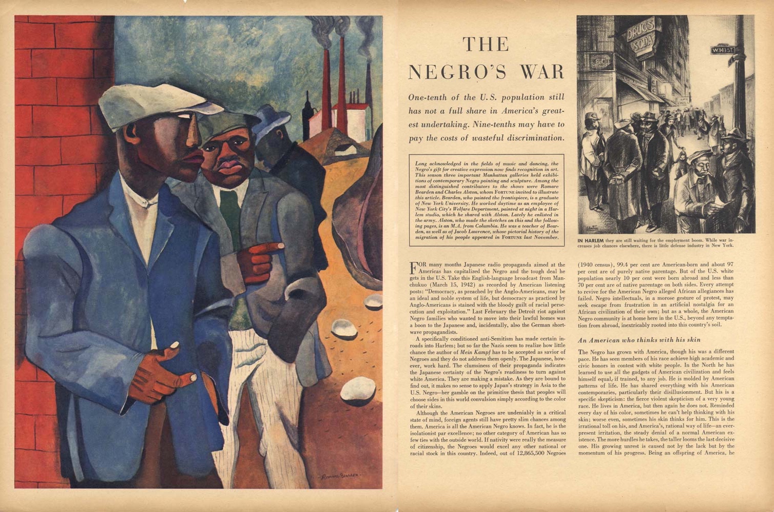
Figure \(\PageIndex{7}\): “The Negro’s War,” Fortune (May 1942)
Bearden convincingly captures this frustration. Three African American men stand in the foreground, while an active steel factory can be clearly seen in the distant background. The man closest to us looks to our right, as if pointing us to the article printed on the magazine’s opposite page. The man behind him looks out at the viewer, but likewise asks us to address the article through the pointing gesture of his right hand. The third man, his anonymous face turned downwards, seemingly ignores the article. Importantly, they are all a great distance from the steel factory in the background, as if they have arrived at the plant hoping to work, but have found that they are excluded.
The United States prepared to enter World War II long before the Japanese attack on Pearl Harbor (December 7, 1941), and President Franklin Delano Roosevelt was keenly aware that entering of the conflict would have a profound affect upon the workforce within the defense industry in the United States. On 25 June 1941 he issued Executive Order 8802, and Bearden’s painting from the following year is a visual representation of it.
Roosevelt wrote:
WHEREAS it is the policy of the United States to encourage full participation in the national defense program by all citizens of the United States, regardless of race, creed, color, or national origin, in the firm belief that the democratic way of life within the Nation can be defended successfully only with the help and support of all groups within its borders; and
WHEREAS there is evidence that available and needed workers have been barred from employment in industries engaged in defense production solely because of considerations of race, creed, color, or national origin, to the detriment of workers’ morale and of national unity:
NOW, THEREFORE, by virtue of the authority vested in me by the Constitution and the statutes, and as a prerequisite to the successful conduct of our national defense production effort, I do hereby reaffirm the policy of the United States that there shall be no discrimination in the employment of workers in defense industries or government because of race, creed, color, or national origin, and I do hereby declare that it is the duty of employers and of labor organizations, in furtherance of said policy and of this order, to provide for the full and equitable participation of all workers in defense industries, without discrimination because of race, creed, color, or national origin…
—President Franklin D. Roosevelt Executive Order 8802 (June 25, 1941)
While there is little doubt that Roosevelt was interested in the ways in which people of German and Italian descent were being barred from employment in the defense sector, he was also keenly aware that African Americans were likewise shunned. And if Bearden’s painting did not make this clear enough, then the article it accompanied made a written argument of the same theme. In it, the author insisted that excluding African Americans from defense jobs was detrimental to industry, harmful to the overall war effort, and even more damaging to society as a whole.
From silver for sugar bowls to steel for submarines
From silver for sugar bowls to steel for submarines, the themes of technology, economics, and labor have played key roles in the development and growth of the American colonies and the United States of America. If we were but a colonial possession when the sugar bowl was made around 1750, we had become a world power 200 years later when Bearden chronicled the frustration of African Americans in being actively excluded from fully participating in the American war effort (and from political, economic, and social equality in the United States more broadly). Throughout this history, the United States has advanced in many areas—”What a fascinating modern age we live in!”—but has at the same time actively sought to exclude particular groups from participating in these developments.
Selected Contributors
Seeing America is developed and distributed by Smarthistory together with a consortium of museums, including:
Amon Carter Museum of American Art
Crystal Bridges Museum of American Art
Fine Arts Museums of San Francisco
Los Angeles County Museum of Art
National Museum of the American Indian, Smithsonian Institution
Pennsylvania Academy of Fine Arts
Smithsonian American Art Museum
1745
The triangle trade and the colonial table: sugar, tea, and slavery
Global trade in a cup of tea: Colonial America, sugar and slavery.
The triangle trade
the colonial table, sugar, tea, and slavery
by BRANDY CULP, WADSWORTH ATHENEUM MUSEUM OF ART and DR. STEVEN ZUCKER
Video \(\PageIndex{1}\): Covered sugar bowl, c. 1745, silver, 11.5 x 9.1 cm (Wadsworth Atheneum Museum of Art). Speakers: Brandy Culp, Wadsworth Atheneum Museum of Art and Dr. Steven Zucker
Test your knowledge with a quiz
Key points
- The history of sugar stretches from India and the Middle East, where it was first grown, to the New World, where it was cultivated by Christopher Columbus and other Europeans. Until the 16th century, when Europe began importing sugar from the Americas, sugar was reserved for the elite in Europe, because it was both rare and expensive.
- A global trade developed around sugar in the 15th and 16th centuries, bolstered by the growing popularity of tea, coffee, chocolate, and punch in Europe. Its expanded production in the New World depended on the labor of enslaved people, many abducted in Africa, to harvest and process sugar cane. Molasses, a byproduct of sugar production, was an important commodity in the triangle trade.
- When tea imported from China became popular in Europe and the Americas in the 1600s, many of the objects associated with the tea service were inspired by objects also imported from China (in this case, the silver sugar bowl is formed in the shape of a Chinese rice bowl). The sugar itself was part of trade exchanges between Africa, the Americas (and the West Indies), and Europe.
- Both the form and the function of this bowl reflect the elite status of its owner. The use of silver for this bowl reflects the expensive nature of sugar, even in the 18th century; its delicate design suggests that it was the work of a master silversmith.
Go deeper
See this object on view at The Wadsworth Atheneum Museum of Art
Use primary sources to learn about the slave trade
Read about the slave trade and African society
Learn more about slavery and the sugar industry
Read about the popularity of tea, coffee, and chocolate in the colonial United States
Learn more about silversmithing in the colonial period
Learn about the use of silver in the 18th, 19th, and 20th centuries
More to think about
This sugar bowl was handmade. In the 21st century, most of the objects in our world are mass produced. Do we look at handmade objects differently now than we did in the preindustrial era?
Smarthistory images for teaching and learning:


Figure \(\PageIndex{8}\): More Smarthistory images…
Selected Contributors
Seeing America is developed and distributed by Smarthistory together with a consortium of museums, including:
Amon Carter Museum of American Art
Crystal Bridges Museum of American Art
Fine Arts Museums of San Francisco
Los Angeles County Museum of Art
National Museum of the American Indian, Smithsonian Institution
Pennsylvania Academy of Fine Arts
Smithsonian American Art Museum
1835
Celebrating the spirit of American enterprise, Bargaining for a Horse
Is there a political message behind this image of two farmers settling the price of a horse?
Celebrating American enterprise
Is there a political message in this image of a deal between two farmers?
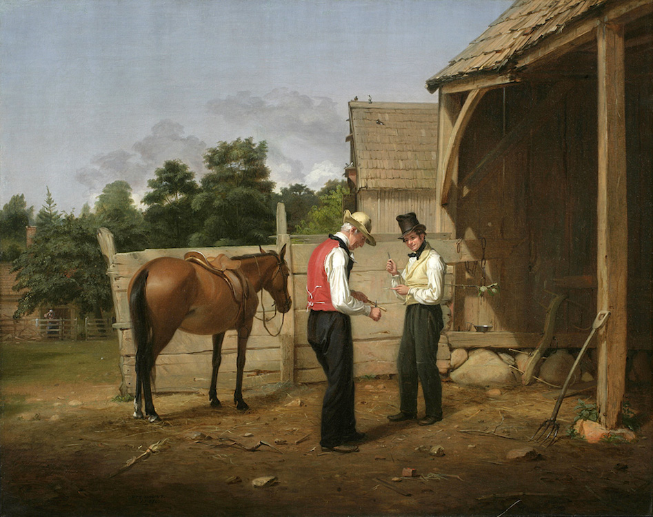
Figure \(\PageIndex{9}\): William Sidney Mount, Bargaining for a Horse, 1835, oil on canvas, 24 x 30 inches (New York Historical Society)
The New York painter William Sidney Mount painted this intimate, comically vibrant picture in 1835. Along with Raffling for the Goose and Eel Spearing at Setauket, Bargaining for a Horse is one of Mount’s great works and a striking example of early nineteenth-century American genre painting at its best.
Mount (and other artists like George Caleb Bingham) captured contemporary scenes of rural American life at the cusp of the country’s transition into urbanization and modernity. Mount’s childhood home in Long Island, once pastoral and sleepy in its cozy insularity, became—like many parts of America—changed by the presence of expanding railroad networks. Mount’s specialty as an artist lay in his ability to document the last remnants of the old Yankee culture of the New York countryside before the Yankee became gentrified and adjusted to the cosmopolitan demands of the nineteenth century (Yankee refers to people from the northeast—especially those descended from colonial New England settlers).
Mount’s ambition to be a history painter
Though a renowned painter of genre scenes, William Sidney Mount had initially set out to be a history painter like Benjamin West. Mount was born into a wealthy land-owning family in Long Island in 1807. When his father died seven years later, Mount was sent to live with his uncle, Micah Hawkins, a successful wholesale grocer. At seventeen, Mount was an apprentice to his brother Henry, a sign painter. He took drawing courses at the National Academy of Design in New York, where he learned to appreciate the work of the Masters of European art and acquired an appreciation of landscapes and history painting. However, Mount’s first major work, a biblical scene, Christ Raising the Daughter of Jairus, received little critical attention when it debuted in 1828.
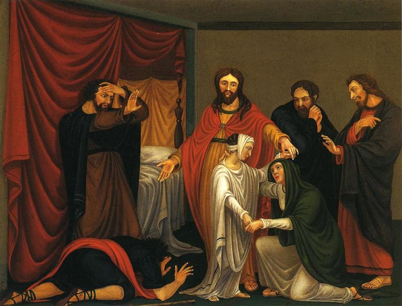
Figure \(\PageIndex{10}\): William Sidney Mount, Christ Raising the Daughter of Jairus, 1828, oil on canvas, 46.04 cm x 62.87 cm, (Museums of Stony Brook)
During the 1820s, a wide variety of landscape and genre prints circulated across the United States. Prints of rustic genre scenes by the Scottish painter David Wilkie were particularly popular with contemporary European and American audiences. Wilkie’s success convinced Mount to turn his attention to genre painting.
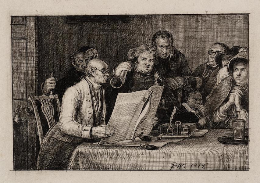
Figure \(\PageIndex{11}\): Sir David Wilkie, Reading the Will, 1819, etching, 6.9 x 10.5 cm (Tate)
Bargaining for a Horse
In Bargaining for a Horse, we see two farmers, both well-dressed and seemingly prosperous, discussing the price of a chestnut mare that the man in the red waistcoat hopes to sell to the man in yellow. The younger man in yellow wears a battered top hat—indicating that he is perhaps a visitor to the farm. Both men are discussing the price of the horse while they “whittle,” or carve sticks of wood with their pocket knives (a popular pastime for men of all ages living in the country). The horse stands at the left tied to the barn door as the shadows stretch into the barn on the right. The demarcation of sunlight across the two men and the horse is a spotlight and creates a stage space for the unfolding comedy. It is likely that someone is going to be short-changed for the horse, but such is the nature of the comedy and the satisfaction within the audience’s suspense. Part of the engine of the comedy is the trap that is being set for the unsuspecting patsy. The scene’s humor also comes from the fact that the men are bargaining with one another while casually scraping away at wooden sticks, subtly masking their masculine authority and aggression in the guise of a popular childhood pastime.
Though the barn and its surroundings (notice the angled slant of the pitchfork on the right) frame the two “actors,” Mount is particular about rooting the scene in the countryside. A woman observes the horse trading from the distant background. She stands behind a split-rail fence underneath several immense trees. In some ways, she is perhaps a stand-in for us, the viewers of the painting. Mount always understood that, like a playwright, he was staging something for an audience, and the placement of the figure in the distance is a sly nod to this realization.
In the nineteenth century, the term “horse-trading” was often a colloquialism for back-room political deals. In the period between 1812 and the Civil War, the dynamic changes in the United States—its urban population growth, the nationwide expansion of railroads and industries, and Westward expansion (the Oregon Trail began in the 1830s)—led to an assertive forcefulness and toughness in the American character, associated in some ways with the presidency of Andrew Jackson and the toughness of the frontier spirit that Jackson exemplified. William Sidney Mount is showing us only a glimpse of this type of personality through the lens of his idea of the rural New Yorker, the New York Yankee so exemplified in the stories of writers such as Washington Irving and the poems of John Pierpont.
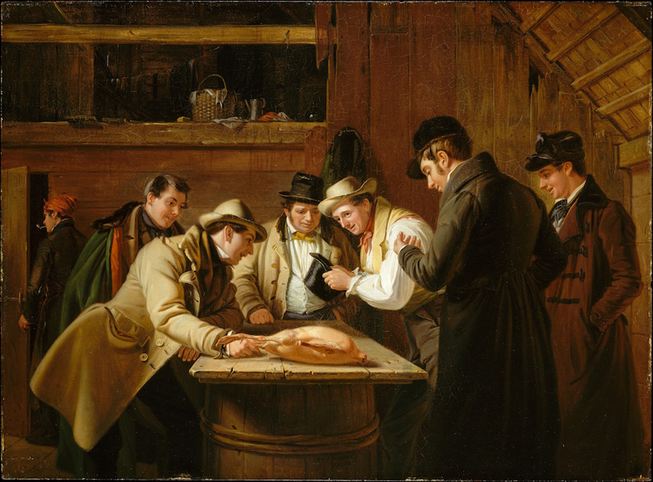
Figure \(\PageIndex{12}\): William Sidney Mount, The Raffle (Raffling for the Goose), 1837, oil on mahogany, 43.2 x 58.7 cm (The Metropolitan Museum of Art)
The resourcefulness of the Yankee merchant or farmer depicted in Mount’s paintings such as Raffling for the Goose (1837, above) and other similar images, is a reflection of the entrepreneurial drive and energy of many Americans in the 1820s and 1830s. In her book American Genre Painting: The Politics of Everyday Life, the art historian Elizabeth Johns describes a character we often see within Mount’s paintings—the Long Island Yankee farmer-merchant—as an emblematic figure of American enterprise. With the growth of urbanization across agrarian towns in the 1830s, and the rise of immigration to the United States from countries in Western and Central Europe, this Yankee figure—often a stage caricature in comic plays who went by the name of Jonathan Ploughboy—became a quasi-nativist representation of small-town cunning and ingenuity. As the United States became more multicultural and diverse, its population sought to redefine aspects of the national character. What precisely made an American, “American”? “With the triumph of the Democrats in national politics in 1828 and the intoxicating expansion of the economy in the early 1830s,” writes Johns, “enthusiasts envisioned a great harmony of individual enterprise and respect—an official recognition at least of the importance of the common man.”
William Sidney Mount’s uncle was an actor in the New York theater world in the early 1810s, and theatricality pervades many of Mount’s paintings. In Bargaining for a Horse and Raffling for the Goose, there is an element of playful humor rooted in the art of the swindle. Mount painted Bargaining for a Horse for his patron, the New York dry goods magnate Lumen Reed, who he had met in 1834. Reed was a keen collector of contemporary art and had become a patron to Asher Durand and Thomas Cole. The original title of the painting was Farmers Bargaining, but Edward Carey changed the title to the more descriptive one we use today when he published an engraving of the image in 1840.
Go deeper
Alfred Frankenstein, Painter of Rural America, William Sidney Mount, 1807-1868 (The Suffolk Museum at Stony Brook, 1968).
Elizabeth Johns, American Genre Painting: The Politics of Everyday Life (Yale University Press, 1993).
Elizabeth Johns, “The Farmer in the Works of William Sidney Mount,” The Journal of Interdisciplinary History, vol. 17, no. 1 (Summer 1986).
Angela Miller, Janet Berlo, and Bryan Wolf, American Encounters: Art, History, and Cultural Identity (Pearson, 2007).
Marianne Doezema and Elizabeth Milroy, ed., Reading American Art (Yale University Press, 1998).
Barbara Novak, American Paintings of the Nineteenth Century: Realism, Idealism and the American Experience (Oxford University Press, 2007).
William T. Oedel and Todd S. Gernes, “William Sidney Mount” in Reading American Art, ed. Marianne Doezema and Elizabeth Milroy (Yale University Press, 1998).
Selected Contributors
Seeing America is developed and distributed by Smarthistory together with a consortium of museums, including:
Amon Carter Museum of American Art
Crystal Bridges Museum of American Art
Fine Arts Museums of San Francisco
Los Angeles County Museum of Art
National Museum of the American Indian, Smithsonian Institution
Pennsylvania Academy of Fine Arts
Smithsonian American Art Museum
1840
Thomas Cole, The Architect's Dream
Cole, the great American landscape painter, looks across the vast history of Western architecture
Dreaming big
Thomas Cole imagines 4,500 years of architectural history
by DR. LAWRENCE W. NICHOLS, TOLEDO MUSEUM OF ART and DR. STEVEN ZUCKER
Video \(\PageIndex{2}\): Thomas Cole, The Architect's Dream, 1840, oil on canvas, 134.7 x 213.6 cm (Toledo Museum of Art). Speakers: Dr. Lawrence W. Nichols, Toledo Museum of Art and Dr. Steven Zucker
Test your knowledge with a quiz
Key Points
- Commissioned by the architect Ithiel Town to paint a landscape of ancient Athens, Thomas Cole created a fantastical array of ancient architecture. This painting reflects ideal and oversized representations of ancient Egyptian, Greek, Roman, and Gothic styles architecture — creating a nostalgia for the glories and character of these lost eras.
- In the nineteenth century, many architects modeled their work on these historical forms creating a series of 19th century revival movements. In particular, American architects drew heavily on ancient Greek and Roman architecture in the design of official and civic buildings, associating their designs with ideals of democracy, strength, and stability.
Go deeper
This painting at the Toledo Museum of Art
Learn more about the architectural styles included in Cole’s painting (Egyptian, Greek, Roman, and Gothic)
Read more about Ithiel Town and see some of the buildings that he designed
Why do so many official buildings look like ancient Greek temples?
Explore the classically-inspired architecture of Washington, DC
Learn more about Thomas Cole on The Metropolitan Museum of Art’s Heilbrunn Timeline of Art History
More to think about
Rather than a recognizable landscape, Thomas Cole created an allegorical vision of the architect’s dream. How can the design of a building suggest a sense of its larger purpose or social function? Think of a building in your neighborhood—how does its design create (or clash) with the community?
Smarthistory images for teaching and learning:
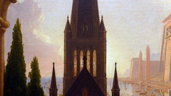
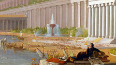
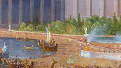
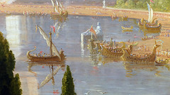
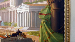
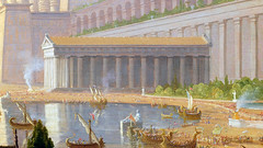

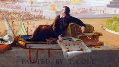


Figure \(\PageIndex{13}\): More Smarthistory images…

Selected Contributors
Seeing America is developed and distributed by Smarthistory together with a consortium of museums, including:
Amon Carter Museum of American Art
Crystal Bridges Museum of American Art
Fine Arts Museums of San Francisco
Los Angeles County Museum of Art
National Museum of the American Indian, Smithsonian Institution
Pennsylvania Academy of Fine Arts
Smithsonian American Art Museum
1849-50
Inventing America: Colt's Experimental Pocket Pistol
The gun that "won the West" also transformed American manufacturing and marketing.
Colt’s Experimental Pocket Pistol
The gun that "won the West" transformed American manufacturing
by BRANDY CULP, WADSWORTH ATHENEUM MUSEUM OF ART and DR. STEVEN ZUCKER
Video \(\PageIndex{3}\): Elisha King Root for Samuel Colt, Experimental Pocket Pistol, Serial number 5, caliber .265 inches, barrel length 3 inches, overall length 7 inches, brass, steel, and iron, 1849-50 (Wadsworth Atheneum Museum of Art, Hartford, Bequest of Elizabeth Hart Jarvis Colt). Speakers: Brandy Culp, Wadsworth Atheneum Museum of Art and Dr. Steven Zucker
Test your knowledge with a quiz
Key points
- Assembly-line methods of construction and more efficient manufacturing processes, like those developed by Samuel Colt and Elisha Root, shifted the center of the Industrial Revolution from England to the United States in the mid-19th century. These improvements were made possible by new levels of precision in the fabrication of individual components so that they could be mass-produced and fitted together by relatively unskilled laborers.
- The Colt gun was an economic success, not just because of the design innovations and manufacturing advances made, but also because Colt developed new strategies of marketing, selling his guns directly to soldiers on the front lines as well as to foreign governments.
- The advancement from a single-shot firing to a multi-chamber gun made the Colt revolver an important tool in American military campaigns during the 19th century. These guns played a role in the settling of the west and the Gold Rush, the Civil War, the Mexican-American War and were used against Native Americans during the Second Seminole War.
Go Deeper
Learn more about this object from the Wadsworth Atheneum Museum of Art
See primary sources related to Colt’s Fire Arms Manufacturing
Learn about the Eli Whitney Armory, an important predecessor to Colt’s factory
Read about the development of a market economy in the U.S. in the early 19th century
Review the impact and significance of the market revolution in the United States
More to think about
In the video, the speakers say, “It’s important not to romanticize these guns,” and describe Samuel Colt as a “complicated” figure in U.S. history. How do you think studying objects such as the Colt revolver can help us understand history from different points of view?
Selected Contributors
Seeing America is developed and distributed by Smarthistory together with a consortium of museums, including:
Amon Carter Museum of American Art
Crystal Bridges Museum of American Art
Fine Arts Museums of San Francisco
Los Angeles County Museum of Art
National Museum of the American Indian, Smithsonian Institution
Pennsylvania Academy of Fine Arts
Smithsonian American Art Museum
1875
Heroes of modern surgery: Eakins's Dr. Gross and Dr. Agnew
Heroes of modern surgery: Eakins' Dr. Gross and Dr. Agnew
Heroes of modern surgery
Drs. Gross and Agnew, and the advance of 19th century medicine
by DR. KATHLEEN ADAIR FOSTER, PHILADELPHIA MUSEUM OF ART and DR. BETH HARRIS
Video \(\PageIndex{4}\): Thomas Eakins, Portrait of Dr. Samuel D. Gross (The Gross Clinic), 1875, oil on canvas, 243.8 x 198.1 cm (Philadelphia Museum of Art) and Thomas Eakins, The Agnew Clinic, 1889, oil on canvas, 214 cm × 300 cm (Philadelphia Museum of Art). Speakers: Dr. Kathleen Adair Foster, Philadelphia Museum of Art and Dr. Beth Harris
Test your knowledge with a quiz
Key points
- The Centennial Exhibition of 1876 celebrated a century of American independence with a world’s fair that showcased American progress. Thomas Eakins painted The Gross Clinic to demonstrate advances in surgical techniques taking place in Philadelphia. Samuel Gross was then one of the nation’s most famous surgeons. The depiction was considered too graphic to be included in the art exhibition, however, and was instead included in a medical display.
- Dr. Gross and Jefferson Medical College represented a shift in surgical capabilities at a moment of rapid improvements in the scientific understanding of medicine and disease. Eakins depicts some of these advancements in the use of anesthesia and the type of surgery shown, which built on new understandings of bone regeneration. Notably, this painting reflects early skepticism about germ theory in the lack of a sterile environment for the surgery.
- The Agnew Clinic, painted fourteen years later, reflects a new round of innovation, as the operating theater is flooded in artificial light, the doctors are dressed in white gowns and use sterilized tools, and a professional female nurse is included.
- Thomas Eakins was a Realist painter, carefully depicting the material facts of medical care in the nineteenth century (and including his own self-portrait in each painting). At the same time, he used composition and light to portray these surgeons as modern heroes.
Go deeper
See The Gross Clinic at the Philadelphia Museum of Art
Learn more about The Gross Clinic
See a preliminary sketch of The Gross Clinic
Learn more about Mary V. Clymer
Read about the Listerian Revolution, the Gross Clinic, and the Agnew Clinic
More to think about
As the video shows, Eakins’s heroic representation of Dr. Gross and Dr. Agnew helped to underscore the significance of their scientific achievement. How do we commemorate important technological advances, and the individuals responsible for them, today?
Selected Contributors
Seeing America is developed and distributed by Smarthistory together with a consortium of museums, including:
Amon Carter Museum of American Art
Crystal Bridges Museum of American Art
Fine Arts Museums of San Francisco
Los Angeles County Museum of Art
National Museum of the American Indian, Smithsonian Institution
Pennsylvania Academy of Fine Arts
Smithsonian American Art Museum
1870
Carving out a life after slavery
This eclectic assortment of carved objects speaks to the experience of a formerly-enslaved man in the post-Civil War South.
Carving out a life after slavery
A desk made by a formerly-enslaved man in the post-Civil War South
by DR. ALEX BORTOLOT, MINNEAPOLIS INSTITUTE OF ART and DR. BETH HARRIS
Video \(\PageIndex{5}\): Writing desk, attributed to William Howard, c. 1870, yellow pine, tobacco box and cotton crate wood, 154.31 75.88 x 60.17 (Minneapolis Institute of Art). Speakers: Dr. Alex Bortolot, Minneapolis Institute of Art and Dr. Beth Harris
Test your knowledge with a quiz
Key points
- Cotton was grown in the South, but often shipped to manufacturing plants in the northern states, making it an important crop for the American economy broadly. While this desk illustrates the tools that would have been familiar to its creator William Howard (a freed slave and laborer on Kirkwood Plantation), its refined decoration also demonstrates a range of influences and interactions that extended far beyond a southern plantation.
- Cotton was labor-intensive and the financial success of plantations such as Kirkwood was dependent on slave labor. Following the Civil War and abolition of slavery, some southern states passed highly discriminatory and restrictive laws known as Black Codes; these laws enabled the exploitative practice of sharecropping, which kept African Americans indebted and reliant on landowners in the South.
Go deeper
See this object in the collection of the Minneapolis Institute of Art (Mia)
See a similar desk attributed to William Howard at the Wadsworth Atheneum
Read about the Black Codes in the Reconstruction era
Learn more about sharecropping in the South
Find out what life was like for African Americans in the years following the Civil War
Use primary sources to learn about slavery and the economic role of cotton in the U.S.
More to think about
In this video, the speakers use the term “enslaved people” instead of the commonly used term “slaves.” Why do you think the speakers made this choice, and do you think such subtle shifts in language can be important?
Selected Contributors
Seeing America is developed and distributed by Smarthistory together with a consortium of museums, including:
Amon Carter Museum of American Art
Crystal Bridges Museum of American Art
Fine Arts Museums of San Francisco
Los Angeles County Museum of Art
National Museum of the American Indian, Smithsonian Institution
Pennsylvania Academy of Fine Arts
Smithsonian American Art Museum
1903-4
A palace for shopping, Louis Sullivan’s Carson Pirie Scott building
Sullivan believed that “form must ever follow function” and designed this department store with that adage in mind.
An early skyscraper
Louis Sullivan’s Carson Pirie Scott Building, a palace for shopping

Figure \(\PageIndex{14}\): Hancock Tower, Chicago (photo: jochemberends, CC: BY-NC-SA 2.0)
Walking amidst the endless crowd of tall buildings in Chicago’s downtown neighborhoods, the twenty-first century viewer, overwhelmed by the colossal Hancock Tower (1970) almost misses the comparatively stocky, whole-block office buildings and stores in Chicago’s Loop that first gave rise to the term “skyscraper” in the late nineteenth century. At the intersection of State and Madison Streets, however, one building with large glass windows and a rounded corner entryway covered with lavish decoration stands out. In contrast to its relatively plain neighbors, the pedestrian’s eye is immediately attracted to the structure’s bronze-colored ground floor and broad white façade stretching twelve stories above it. This is Louis Sullivan’s Carson, Pirie, Scott building, a department store constructed in two stages in 1899 and 1903-04.

Figure \(\PageIndex{15}\): Louis Sullivan, Carson, Pirie, Scott Building, 1899 and 1903-04, Chicago (photo: Scott Fisher, CC: BY-NC 2.0)
Sullivan’s building is an important example of early Chicago skyscraper architecture, and can also be seen as a fascinating indicator of the relationship between architecture and commerce. The firm of Adler & Sullivan first became known in Chicago in the early 1880s for the design of the Auditorium Building (see below) and other landmarks utilizing new methods of steel frame construction and a uniquely American blend of Art Nouveau decoration with a simplified monumentality.

Figure \(\PageIndex{16}\): Dankmar Adler & Louis Sullivan, Auditorium Building, 1889, Chicago
By the mid-1890s, Sullivan struck out on his own and wrote his treatise on skyscraper architecture, “The Tall Office Building Artistically Considered.” In it, Sullivan analyzed the problem of high-rise commercial architecture, arguing with his famous phrase “form must ever follow function” that a building’s design must reflect the social purpose of a particular space.

Figure \(\PageIndex{17}\): Louis Sullivan, Carson, Pirie, Scott Building, Chicago (while still Schlesinger & Mayer, with original cornice and before addition at right)
Sullivan illustrates this philosophy by describing an ideal tripartite skyscraper. First, there should be a base level with a ground floor for businesses that require easy public access, light, and open space, and a second story also publicly accessible by stairways. These floors should then be followed by an infinite number of stories for offices, designed to look all the same because they serve the same function. Finally, the building should be topped with an attic storey and distinct cornice line to mark its endpoint and set it apart from other buildings within the cityscape. For Sullivan, the characteristic feature of a skyscraper was that it was tall, and so the building’s design should serve that goal by emphasizing its upward momentum.

Figure \(\PageIndex{18}\): Louis Sullivan, The Wainwright Building, 1891, St. Louis (photo: Tom Bastin, CC: BY 2.0)
By the turn of the century, Sullivan adapted these ideas to a new context, a department store for the Schlesinger & Mayer company that was soon purchased by Carson, Pirie, Scott. In contrast to Sullivan’s earlier office buildings (like the 1891 Wainwright Building in St. Louis—image left), Carson, Pirie, Scott in downtown Chicago was intended to meet its patron’s needs in a much different way. Instead of emphasizing the beehive of identical windows meant to reflect the identical work taking place in each individual office, in the Carson Pirie Scott building, Sullivan highlighted instead the lower street-level section and entryway to draw shoppers into the store. This was done in a number of ways. The windows on the ground floor, displaying the store’s products, are much larger than those above. The three doors of the main entrance were placed within a rounded bay on the corner of the site, so that they are visible from all directions approaching the building.

Figure \(\PageIndex{19}\): Detail of corner entrance, Louis Sullivan, Carson, Pirie, Scott Building, 1899 and 1903-04, Chicago (photo: Chris Smith, CC: BY-NC-SA 2.0)
The corner entryway and the entire base section are differentiated from the spare upper stories by a unified system of extremely ornate decoration. The cast-iron ornament contains the same highly complicated, delicate, organic and floral motifs that had become hallmarks of Sullivan’s design aesthetic. For Sullivan, the decorative program served a functional project as well, to distinguish the building from those surrounding it, and to make the store attractive to potential customers.

Figure \(\PageIndex{20}\): Detail of corner entrance, Louis Sullivan, Carson, Pirie, Scott Building, 1899 and 1903-04, Chicago (photo: Dauvit Alexander, CC: BY-NC-SA 2.0)
The upper parts of the Carson, Pirie, Scott building also reflect Sullivan’s adaptation of his skyscraper theory to a department store. Each successive story of the white terra-cotta façade contains identical windows, in this case the three-sectioned “Chicago” window common to late nineteenth-century skyscrapers in the city. There is an overhanging cornice at the very top that seems to signify the end of the building’s ascent, and makes the slightly set-back attic level distinct from the broad mid-section and the dark cast-iron decoration of the base level.

Figure \(\PageIndex{21}\): Detail of terracotta exterior with “Chicago” windows at right, Louis Sullivan, Carson, Pirie, Scott Building, 1899 and 1903-04, Chicago (photo: Kevin Zolkiewicz, CC: BY-NC-SA 2.0)
Unlike Sullivan’s office buildings, however, the building’s primary thrust is horizontal rather than vertical. Sullivan’s design emphasizes the long, uninterrupted lines running under each window from each side of the building towards the entry bay, while the decorative base at the bottom and the cornice line at the top flow seamlessly around the corner.

Figure \(\PageIndex{22}\): Open floorplan
The wide rectangular window frames and relatively squat twelve-story frame were intended to meet the specific requirements of a department store, whose mission called for expansive open spaces to display products to customers, not endless individual offices.

Figure \(\PageIndex{23}\): Reconstructed cornice detail, Louis Sullivan, Carson, Pirie, Scott Building, 1899 and 1903-04, Chicago
Some later critics like Lewis Mumford and Sigfried Giedion viewed the lower, ornamental section of Sullivan’s Carson Pirie Scott building as an uncomfortable disruption to the otherwise stripped-down, planar style they favored. Nevertheless, the building’s continuous operation well into the twenty-first century speaks not only to the prestige of Sullivan’s name, but also to the sustained value of architecture as a corporate symbol.

Figure \(\PageIndex{24}\): Terracotta detail, Louis Sullivan, Carson, Pirie, Scott, 1899, 1903-04, Chicago (photo: Steve Minor, all rights reserved, by permission)
With its elaborate decorative program and attention paid to the functional requirements of retail architecture, Sullivan’s design was a remarkably successful display for the department store’s products, even if it diverged from the wholly vertical effect of his earlier skyscrapers.
Go deeper
Louis Sullivan, “The Tall Office Building Artistically Considered,” 1896
Louis Sullivan Collection at the Art Institute of Chicago (includes a short biography)
Selected Contributors
Seeing America is developed and distributed by Smarthistory together with a consortium of museums, including:
Amon Carter Museum of American Art
Crystal Bridges Museum of American Art
Fine Arts Museums of San Francisco
Los Angeles County Museum of Art
National Museum of the American Indian, Smithsonian Institution
Pennsylvania Academy of Fine Arts
Smithsonian American Art Museum
1904
American brilliance at the St. Louis World's Fair
This dazzling, prismatic, brilliant cut glass creates a universe of pattern and reflection.
American brilliance
Centerpiece of the St. Louis World's Fair, Libbey's Punch Bowl
by DIANE C. WRIGHT, TOLEDO MUSEUM OF ART and DR. BETH HARRIS
Video \(\PageIndex{6}\): Libbey Glass Company, Punch Bowl and stand with 23 cups, 1904, thick colorless glass, 54.6 x 60.6 x 60.6 cm, 134 pounds (Toledo Museum of Art). Speakers: Diane C. Wright, Toledo Museum of Art and Dr. Beth Harris
Test your knowledge with a quiz
Key Points
- The 1904 World’s Fair in St. Louis celebrated the centennial of the Louisiana Purchase. An international success, it drew more than nineteen million visitors. World’s fairs such as this were designed to establish the U.S. as a leader in art, technology, and manufacturing.
- Glassmaking had a long history in America as one of the first industries developed by the early colonists. The “Brilliant Period” of cut glass, represented by this punch bowl set, was an American style of glassmaking that gained worldwide recognition.
- This punchbowl, made by the Libbey Glass Company, represented an exceptional level of craftsmanship in terms of its scale and decoration. Each piece would be blown before being hand-cut in the intricate geometric pattern to achieve the full reflective effect. This set was a showcase for American skill and mastery, although many of the craftsmen were likely immigrants themselves.
Go deeper
This punch bowl in the Toledo Museum of Art
Learn about American Brilliant Cut Glass
Learn more about the Libbey Glass Company
View an online exhibition about the 1904 World Exposition in St. Louis
More to think about
As the speakers note, beautiful hand-crafted objects, like this punch bowl, seem remarkable today when most consumer goods are mass produced using mechanical methods. But while mass-production might affect our appreciation for such objects, it also makes these items more affordable to the wider population. What is lost and what is gained as craftsmanship is replaced by manufacturing? Consider how the wider availability of such luxury objects might affect their function as symbols of social status, wealth, and class. How important is their craftsmanship and production to this role?
Smarthistory images for teaching and learning:

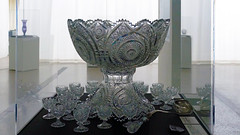





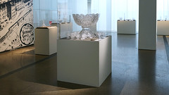


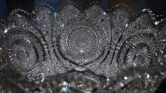

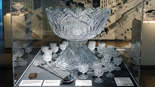

Figure \(\PageIndex{25}\): More Smarthistory images…
Selected Contributors
Seeing America is developed and distributed by Smarthistory together with a consortium of museums, including:
Amon Carter Museum of American Art
Crystal Bridges Museum of American Art
Fine Arts Museums of San Francisco
Los Angeles County Museum of Art
National Museum of the American Indian, Smithsonian Institution
Pennsylvania Academy of Fine Arts
Smithsonian American Art Museum
1910
A Landmark Decision: Penn Station and architectural heritage
New York put growth ahead of all else, resulting in the loss of important historic buildings, like Penn Station.
A Landmark Decision
Penn Station's destruction, and the preservation of architectural heritage
by DR. MATTHEW A. POSTAL and DR. STEVEN ZUCKER
Video \(\PageIndex{7}\): Dr. Matthew A. Postal and Dr. Steven Zucker discuss landmarks preservation in New York City while visiting: Charles Luckman Associates's Madison Square Garden and Pennsylvania Station, the former site of Charles McKim for McKim Mead, & White, Pennsylvania Station (New York City), 1910 and then visiting Reed & Stem, Warren & Wetmore's Grand Central Terminal, 1912
Smarthistory images for teaching and learning:
Learn More on Smarthistory" data-safe-src="https://farm1.static.flickr.com/959/...67a3be24_m.jpg" src="https://farm1.static.flickr.com/959/...67a3be24_m.jpg" style="width: 206px; height: 135px;">

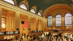
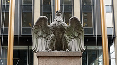
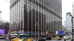
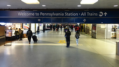

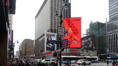
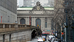
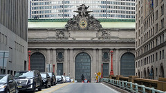

Figure \(\PageIndex{26}\): More Smarthistory images…
Selected Contributors
Seeing America is developed and distributed by Smarthistory together with a consortium of museums, including:
Amon Carter Museum of American Art
Crystal Bridges Museum of American Art
Fine Arts Museums of San Francisco
Los Angeles County Museum of Art
National Museum of the American Indian, Smithsonian Institution
Pennsylvania Academy of Fine Arts
Smithsonian American Art Museum
1913
Going to the cinema in 1913 New York
When movies were new and lights transformed the darkened city streets.
Going to the movies in 1913
How cinema transformed the dark streets of New York City
by DR. LAWRENCE W. NICHOLS, TOLEDO MUSEUM OF ART and DR. STEVEN ZUCKER
Video \(\PageIndex{8}\): John Sloan, Movies, 1913, oil on canvas, 50.3 x 61 cm (Toledo Museum of Art). Speakers: Dr. Lawrence W. Nichols, Toledo Museum of Art and Dr. Steven Zucker
Test your knowledge with a quiz
Key points
- John Sloan broke with the established traditions of fine art, taking the city streets of New York as his subject. Along with Robert Henri and other members of the Ashcan School, Sloan captured the grittiness and energy of urban life in the early twentieth century.
- This working class neighborhood is occupied by many different types of people, whom Sloan describes through their clothing and their gestures. His broad brushstrokes create a sense of excitement and instability. At the same time, Sloan preserves certain details (including the provocative title of the movie, Romance of the Harem), but refrains from any moral judgment.
- Sloan was instrumental in the introduction of European modern art in America. He was part of the independent group known as The Eight, which revolted against the conservative National Academy of Design in 1908, and he also helped organize the Armory Show of 1913, which introduced American and European modernism to the general public.
- Sloan’s interest in the lives of working class people was influenced by his Socialist politics. He supported Socialist causes and volunteered as the art editor for the political magazine, The Masses.
Go Deeper
This painting at the Toledo Museum of Art
Read about the Ashcan school of art
Read more about John Sloan and explore his archives and diaries
Learn about the 1913 Armory Show through this online exhibition of primary sources
See original issues of radical periodical The Masses, published from 1911 – 1917
Learn more about popular entertainment in the early 20th century
More to think about

Figure \(\PageIndex{26}\): Reginald Marsh, Wooden Horses, 1936, tempera on board, 61 x 101.6 cm (Wadsworth Atheneum Museum of Art
Realist painters captured elements of everyday life, including the leisure activities and entertainment of the working classes. Compare John Sloan’s Movies with Reginald Marsh’s depiction of Coney Island, Wooden Horses. How would you describe the overall atmosphere and mood of each painting? What choices in terms of color, composition, and brushstroke contribute to that feeling? What details did each artist include to communicate ideas about class, society, and popular culture of the period?
Smarthistory images for teaching and learning:
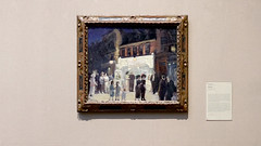
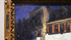
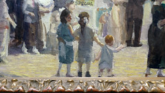
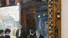
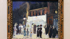
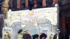
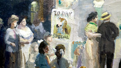
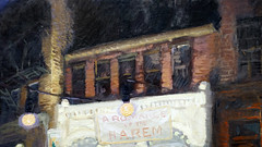
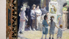
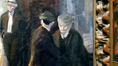
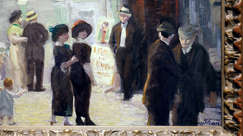

Figure \(\PageIndex{27}\): More Smarthistory images…
Selected Contributors
Seeing America is developed and distributed by Smarthistory together with a consortium of museums, including:
Amon Carter Museum of American Art
Crystal Bridges Museum of American Art
Fine Arts Museums of San Francisco
Los Angeles County Museum of Art
National Museum of the American Indian, Smithsonian Institution
Pennsylvania Academy of Fine Arts
Smithsonian American Art Museum
1927
Elsie Driggs, Blast Furnaces
The awesome steel mills of Pittsburgh in the 1920s made an impression on the young Elsie Driggs.
Elsie Driggs, Blast Furnaces
The moment of American Industry
by DR. JENNIFER PADGETT, CRYSTAL BRIDGES MUSEUM OF AMERICAN ART and DR. STEVEN ZUCKER
Video \(\PageIndex{9}\): Elsie Driggs, Blast Furnaces, 1927, oil on canvas, 83.8 x 99.1 cm (Crystal Bridges Museum of American Art, Bentonville, Arkansas, 2017)
Test your knowledge with a quiz
Key points
- The 1920s was a decade of industrial growth and innovation in America. Plants like the one depicted in Elsie Driggs’s Blast Furnaces provided the necessary steel for many industries that prospered during these years. This economic expansion ended abruptly with the stock market crash of 1929.
- Manufacturing towns, like Pittsburgh, had been the site of labor struggles throughout the late 19th and early 20th centuries. These were often violent clashes that pitted the workers against plant owners and managers.
- While Elsie Driggs brings a classical sense of order and geometry to Blast Furnaces, her dark color palette and dehumanized approach to the subject suggest her ambivalence about modern industry and progress.
Go deeper
This painting at The Crystal Bridges Museum of American Art
Read more about American industrialization during the 1920s
Learn more about labor struggles around the turn of the century
Watch a short video about the Homestead Steel Strike of 1892 from PBS
Primary source documents about the Homestead Steel Strike at the Library of Congress
Explore primary source documents about the Homestead Strike
View photographs of the Jones & Laughlin steel plant where Driggs sketched
History of steel production in Pennsylvania
More to think about
Elsie Driggs was not alone in bringing traditions of order and geometry to industrial subjects in the 1920s. Compare Blast Furnaces with Charles Demuth’s My Egypt (1927). What similarities do you notice? Do both paintings suggest the same feelings about modern industry? If not, what makes the difference between them?
Blast Furnaces and Pennsylvania Station Excavation by George Bellows both express ambivalence towards industry and progress. Look closely at the two paintings. How do they communicate this ambivalence? Are there differences in the way they depict modern industry?
Selected Contributors
Seeing America is developed and distributed by Smarthistory together with a consortium of museums, including:
Amon Carter Museum of American Art
Crystal Bridges Museum of American Art
Fine Arts Museums of San Francisco
Los Angeles County Museum of Art
National Museum of the American Indian, Smithsonian Institution
Pennsylvania Academy of Fine Arts
Smithsonian American Art Museum
1930
Skyscrapers, cars, and American ambition: The Chrysler Building
The Art Deco style of this skyscraper was urbane and luxurious—a swansong of glamor as the Great Depression hit.
The Chrysler Building
Skyscrapers, cars, and American ambition of the eve of the Great Depression

Figure \(\PageIndex{28}\): Chrysler Building, photo: David Shankbone, CC: BY-SA 3.0

With its sky-piercing spire, its sleek, metallic ornament poking out over the streetscape, and its luxurious marble- and metal-lined interiors, the Chrysler Building epitomizes its time: an era of concentrated wealth, industrial power, and large-scale city building. It is often said that architecture is a measure of civilization. If so, there may be few better artifacts of the short-lived epoch called the Roaring Twenties than the Chrysler Building. Ironically, the Art Deco Chrysler Building also marked the end of that dizzying period.
Race to the top
In 1927, Architect William Van Alen received a commission for an office tower from real-estate developer William H. Reynolds. It was to be 808 feet tall with a crowning glass dome meant to “give the effect of a great jeweled sphere.” With mounting costs, Reynolds sold the lease in late 1928 to Walter P. Chrysler, who had formed his automobile manufacturing company in Detroit three years earlier and wanted to make a visible statement about his newfound prominence in business—he said the building would be “dedicated as a sound contribution to business progress.” Chrysler asked Van Alen to make his tower the tallest building in the world, but this was no singular act of hubris on Chrysler’s part. Both men had an interest in making the Chrysler Building as tall, glamorous, and unique as possible.
In the late 1920s, New York’s architects and developers were caught in a race to construct ever-taller buildings. By 1929, the Bank of Manhattan Trust Building on Wall Street (927 feet tall) was set to become the world’s tallest, displacing Cass Gilbert’s Woolworth Building (792 feet tall), which had held the honor since 1913. Several other buildings going up in the late 1920s near Wall Street also aimed for distinction and height.
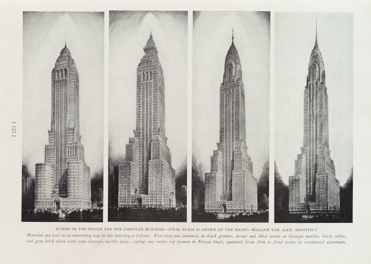
Figure \(\PageIndex{29}\): Stages in the design for the Chrysler building, Progressive Architecture, v. 10, July-Dec 1929, page 525

Figure \(\PageIndex{30}\): Chrysler Building Spire mechanism, Popular Science Monthly, August 1930, page 52
The competition for the tallest building was fiercest between Van Alen and his former business partner, Craig Severance (architect of the Bank of Manhattan Trust Building along with Yasuo Matsui). In the end, Van Alen triumphed: in secret, he had the 185-foot spire of the Chrysler constructed in sections and assembled inside the building, then hoisted up and through the top (diagram right) only after Severance’s Bank of Manhattan Trust tower had reached its full height in November 1929. With the spire, the Chrysler now reached 1,046 feet. It claimed the title of world’s tallest building from its official completion on May 27, 1930, until the completion of the Empire State Building on April 11, 1931.
The Chrysler Building’s overall shape and composition put it into a distinctive local tradition of skyscraper design. New York architects developed a particular way of handling New York City’s 1916 zoning resolution known as the “setback” law. Although not all skyscrapers followed the model, it was a popular formula: a broad base on top of which rose a slender tower, often incorporating setbacks at multiple levels, all topped by a pyramidal cap or spire. Important examples include the Manhattan Life Insurance Building (completed 1894), the Singer Building (1908), the Metropolitan Life Insurance Tower (1909), the Woolworth Building (1913), and, of course, the Bank of Manhattan Trust (1930), Chrysler (1930), and Empire State Building (1931).

Figure \(\PageIndex{31}\): Left: Art Nouveau architecture, Fine art building, Prima Esposizione Internazionale d’Arte Decorativa Moderna, Turin, 1902; right: Art Deco architecture, Pavillon du Bon Marché, Exposition internationale des Arts décoratifs et industriels modernes de Paris en 1925, postcard, Les Éditions artistiques LIP : Paris & ses Merveilles – imprimeur: J. Cormault à Paris, 1925
Art Deco
The Chrysler Building’s style—Art Deco—was considered modern, urbane, and luxurious. The term itself originated from the Exposition internationale des Arts Décoratifs et industriels modernes (International Exhibition of Modern Decorative and Industrial Arts), held in Paris in 1925 (above right), but the roots of the style went back further. Art Deco could describe everything from the style of a corporate office tower (such as the Chrysler Building), to the decorative pattern on furniture, murals, and tilework. The style incorporated chevron, sunburst, fountain, and arc motifs, endless varieties of geometric patterns, and, in later instances especially, cubic and machine-like forms. It was generally more rectilinear than the swirling floral and vegetal patterns common in the earlier Art Nouveau (above left), and was quite distinct from the forms and details of classical Beaux-Arts architecture and ornament, which was prominent in the early twentieth century.

Figure \(\PageIndex{32}\): Automobile friezes in the brickwork, photo: cogito ergo imago, CC: BY-SA 2.0
It would be an exaggeration to say that Art Deco fully rejected the Art Nouveau or the Beaux-Arts styles; instead, Art Deco designers synthesized and abstracted earlier motifs and patterns to create a decorative layer on buildings laid out in otherwise conventional ways. In New York, Art Deco exteriors ran a spectrum from the ornate to the spare (the Chrysler falls in the middle range of that spectrum). Interiors, however, tended to be colorful and lively, with marble and metal details in color schemes dominated by gold, silver, black, red, and green.

Figure \(\PageIndex{33}\): Eagle, Chrysler Building, 1931, photo: Jason Eppink, CC: BY 2.0

At the Chrysler Building, the distinctive elements of Art Deco include the horizontal black-and-white stripes between floors, the geometric decoration concentrated at each of the setbacks, the streamlined eagle heads and radiator caps with wings (referencing the hallmark Chrysler car ornaments) jutting out from the corners, and, above all, the great crown with its seven layers of crescent setbacks inset with triangular windows. Brightly lit at night, the crown is still one of the most distinctive elements on the New York City skyline. Although the ground-level experience is often described as lackluster, the building’s contribution to the skyline is its true achievement. It made the Chrysler Building a symbol of urban modernity, of New York’s business dynamism, and of the vibrant nightlife of the world’s newest metropolis.

Figure \(\PageIndex{34}\): Chrysler Building at night, photo: Kim Carpenter, CC: BY 2.0
Depression and Modernity
The stock market crashed on October 29, 1929, in the midst of the Chrysler Building’s construction. This initial shock did not immediately lead to the economic ruin of the Great Depression—that set in a few years later. However, the glamour, economic growth, and optimism associated with the Roaring Twenties was over. For some, the Chrysler Building came to be a symbol of a lost, hedonistic era, having resulted from the same supposedly rational economic decisions that had led to the market crash. However, some commentators in the 1930s also suggested the building’s lights and upward thrust be seen as symbols of hope for a better future.

Figure \(\PageIndex{35}\): Detail, Edward Trumbull, Transport and Human Endeavor, oil on canvas attached to lobby ceiling, 1930
The 1920s was a decade of great wealth disparities. Rich bankers and industrialists, including Walter Chrysler, had done very well. They used their patronage of architecture to convey their high status and the power some believed rightly accrued to those who had prospered in the system of American industrial capitalism. One could argue that the Chrysler Building’s height, glamour, and prestige was concocted to celebrate one man whose wealth was the result of huge profits he accrued at the expense of poorly paid laborers and other workers.

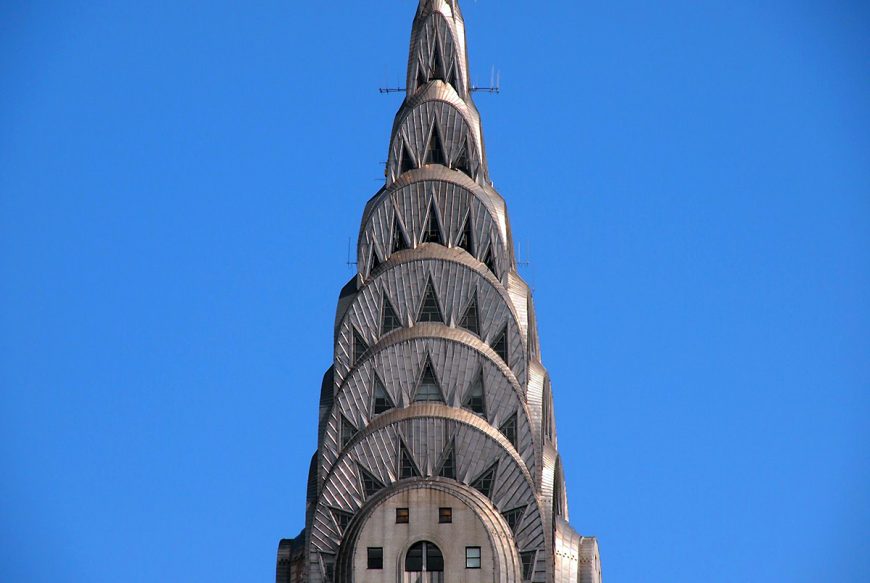

Figure \(\PageIndex{36}\): Chrysler Building Spire, photo: Paul Arps, CC: BY 2.0
But few buildings are only about one person. A huge building like the Chrysler cannot help but also be a monument in the city that surrounds it, and as such it helped fix for decades to come New Yorkers’ understanding of their city as stylish and forward-looking. After the depression and World War II, New York City became the world’s foremost cultural center. And the Chrysler Building was still there, glimmering high above almost everything else as a beacon and symbol of the city’s persistent optimism.

Figure \(\PageIndex{37}\): New York City Skyline, Public Domain CC0 1.0
Additional Resources:
NYC Landmarks Preservation Commission designation report
1916 NYC Building Zone Resolution “set-back law”
Abramson, Daniel. Skyscraper Rivals: The AIG Building and the Architecture of Wall Street. New York: Princeton Architectural Press, 2001.
Bayer, Patricia. Art Deco Architecture: Design, Decoration, and Detail from the Twenties and Thirties. New York: Thames & Hudson, 1999.
Stern, Robert A.M., Gregory Gilmartin, and Thomas Mellins. New York 1930: Architecture and Urbanism between the Two World Wars, 587-615. New York: Rizzoli, 1994.
Stravitz, David. The Chrysler Building: Creating a New York Icon, Day by Day. New York: Princeton Architectural Press, 2002.
Selected Contributors
Seeing America is developed and distributed by Smarthistory together with a consortium of museums, including:
Amon Carter Museum of American Art
Crystal Bridges Museum of American Art
Fine Arts Museums of San Francisco
Los Angeles County Museum of Art
National Museum of the American Indian, Smithsonian Institution
Pennsylvania Academy of Fine Arts
Smithsonian American Art Museum
1931
Mexican Muralism in Depression era New York
The brutal history of Mexico told through fresco in Depression era New York.
Diego Rivera in Depression-era New York
The brutal history of Mexico told through fresco
by DR. MATTHEW AFFRON and DR. STEVEN ZUCKER
Video \(\PageIndex{10}\): José Diego María Rivera, Sugar Cane, 1931, fresco, 145.1 × 239.1 cm © 2014 Banco de México Diego Rivera Frida Kahlo Museums Trust, Mexico, D.F. (Philadelphia Museum of Art). Speakers: Dr. Matthew Affron and Dr. Steven Zucker
Test your knowledge with a quiz
Key points
- In the years following the Mexican Revolution, murals became an important tool for political propaganda and mass education. Decorating public spaces in a realist style, these paintings recount the history and struggles of the people in Mexico.
- Diego Rivera was influenced by Marxism and many of his paintings focus on class struggle, compounded by the legacies of colonialism and racism. Although he was occasionally supported by wealthy American patrons, his political message was intended to support the working class.
- Born in Mexico but trained in Europe, Diego Rivera combined ancient and modern techniques in his art. The fresco technique (painting on walls) has roots in both Italian and Mexican art; Rivera’s invention of portable murals allowed his work to be widely seen while remaining connected to a long tradition of public painting.
Go deeper
See this work of art in the collection of the Philadelphia Museum of Art
Learn more about the Mexican Revolution through primary sources
Find out how art and music played a role in the Mexican Revolution
What were relations between the U.S. and Mexico like during the Mexican Revolution?
View images and the catalogue from Diego Rivera’s 1931 solo exhibition at MoMA in New York City
Learn about the technique of fresco and how Diego Rivera created his murals
More to think about
As discussed in the video, large scale public frescoes by Rivera and other Mexican muralists served an important function as political propaganda in the years after the Mexican Revolution. Can you identify any public art where you live, and if so, does it stake out a political position?
Selected Contributors
Seeing America is developed and distributed by Smarthistory together with a consortium of museums, including:
Amon Carter Museum of American Art
Crystal Bridges Museum of American Art
Fine Arts Museums of San Francisco
Los Angeles County Museum of Art
National Museum of the American Indian, Smithsonian Institution
Pennsylvania Academy of Fine Arts
Smithsonian American Art Museum
1939
The modern home: Russel Wright and the best-selling dinnerware of all time
Pour a little out for the proletariat: the Robin Hood of earthenware pitchers brought modern design to the people.

Figure \(\PageIndex{38}\): Russel Wright, made by Steubenville Pottery, Steubenville, OH, “American Modern” pitchers, 1939, earthenware
Democratizing design and stimulating the economy
Industrial designer Russel Wright released a line of dinnerware in 1939 that he called “American Modern,” a name that encapsulated much of his design philosophy. Wright was looking to create a distinctively American product that brought fresh, modern design to a wide public, all of which constituted innovative thinking in the 1930s.
Wright was one of a small group of designers, many of whom (like Wright) had started in set design for theater or movies, and were forging the new profession of designing for American industrial production. With the motto “good design is for everyone,” Wright, along with his fellow industrial designers, sought to democratize design by creating inexpensive, mass-produced objects for the American home. As the economy was struggling to recover from the Great Depression in the 1930s, industrial design became more than an aesthetic enterprise, it was also seen as a way to stimulate consumer spending and thereby pull America out of its economic malaise.
Simple shapes, unostentatious materials
Before the dinnerware line, Wright had designed “American Modern” furniture (1935), which was launched in complete display rooms—a novel marketing concept—at Macy’s in New York. In this furniture group’s design, Wright found the formula that was to inform his work from then on. Simple shapes and unostentatious materials, carefully modulated for human use, and straightforward in form: Wright’s work in all media, from the mid-1930s until he closed his office in the mid-1960s, bears this consistent design philosophy.
“American Modern” dinnerware, introduced in 1939, became the best-selling dinnerware line of all time. It quickly made Wright literally a household name, as he, along with his wife/business partner Mary, originated the idea of stamping the designer’s signature into the bottom of each mass-produced piece produced. The success of “American Modern” furniture and dinnerware catapulted Wright to national prominence as a designer, and a multiplicity of commissions followed. In the course of a thirty-year career, Wright designed hundreds of objects including furniture, lamps, glassware, metalware, and textiles for the home, as well as occasional school and outdoor furniture, appliances and other commercial applications. Quaker plainness and pioneer ruggedness distinguish his designs, along with a particularly American delight in the newest materials and their possibilities, such as plastics, the most exciting material in the post-World War II era.

Figure \(\PageIndex{39}\): Russel Wright, “American Modern” furniture line, 1935
American forms
A rootedness in American forms and sensibility was a hallmark of Wright’s work. His use of distinctively American materials like solid rock maple; his straightforward, unadorned forms; and his simple dignity of line recalled American artisans such as the Shakers, Gustav Stickley, and the Greene brothers. The pitcher in the “American Modern” line incorporates these concepts, while its high-arching spout invites comparison to a utilitarian object like a coal scuttle.
Honesty and simplicity were not the only qualities Wright was evoking in his “American Modern” designs. He, along with his fellow industrial designers at the time, such as Charles and Ray Eames, Eero Saarinen, Henry Dreyfuss, and Raymond Loewy, picked up the banner of Modernism that had begun in Europe and transferred it to an American audience. Clean, simple forms and an avoidance of applied extraneous ornament were hallmarks of an ideology that sought to create a wholly new, non-referential, abstracted kind of design for the modern world. In objects like the “American Modern” pitcher, Russel Wright was credited with bringing an approachable Modernism to the American public, who were leery of the spare hard edges they associated with avant-garde European design. This was a synthesis for popular consumption, or as Macy’s phrased it for its buying public, “not quaint Colonial, nor dizzy modern.”
Informality—an American attribute
Not content merely to provide Americans with the kind of objects they should have for the 20th century, Wright and his wife Mary wrote a book in 1950 that verbalized ideas of a new informal lifestyle, one they considered consistent with the national character and with the times. Guide to Easier Living showed the country how to live more simply in a post-servant world, to have buffet suppers and design their homes with open kitchen/living/dining rooms, bring the children into the living room, and put their feet on the coffee table. Informality, the Wrights believed, was American, and this distinction from European tradition and decorum appealed to the increasingly urgent desire of Americans to distinguish themselves from the Old World politically, economically, and socially.

Figure \(\PageIndex{40}\): Russel Wright, made by Steubenville Pottery in Steubenville, OH, “American Modern” dinnerware, 1939, earthenware
From oven to table
Tableware like the “American Modern” line allowed buyers to choose their own combinations of colors and types, and it featured the ability to go from oven to table, to reduce dish-washing. Multi-purpose pieces were also part of the line, with handled bowls that could be used for a variety of foods, and the pitcher’s generic form allowed it to be used for all kinds of liquids. In the postwar era, issues such as consumer choice, color variety, mid-point pricing, and practicality were to become important characteristics of the plethora of goods produced for the voracious American middle class.
Russel Wright’s “American Modern” pitcher is emblematic of the innovative designs that spoke to the preoccupations of the country in the pre- and post-war years. This inexpensive, mass-produced earthenware with curving, organic forms and softly-toned glazes was an introduction to the modern world in design and lifestyle for millions of Americans in the mid-twentieth century.
Go deeper
Albrecht, Donald, Robert Schonfeld, and Lindsay Stamm. Shapiro. Russel Wright: Creating American Lifestyle. New York: H.N. Abrams, 2001.
Albrecht, Donald, and Dianne Pierce. Russel Wright: The Nature of Design. New Paltz, NY: Samuel Dorsky Museum of Art, 2012.
Hennessey, William J., and Russell Lynes. Russel Wright, American Designer. Cambridge, MA: MIT, 1983.
The Russel Wright Design Center
Russel Wright at the Cooper Hewitt, National Design Museum
Selected Contributors
Seeing America is developed and distributed by Smarthistory together with a consortium of museums, including:
Amon Carter Museum of American Art
Crystal Bridges Museum of American Art
Fine Arts Museums of San Francisco
Los Angeles County Museum of Art
National Museum of the American Indian, Smithsonian Institution
Pennsylvania Academy of Fine Arts
Smithsonian American Art Museum
1942
Work, war, and racism: Bearden's Factory Workers
During World War II, racism flourished the United States even as the war effort sought to bring people together.
Work, war, and racism
Romare Bearden and the portrayal of mid-century discrimination
by DENNIS MICHAEL JON, MINNEAPOLIS INSTITUTE OF ART and DR. BETH HARRIS
Video \(\PageIndex{11}\): Romare Bearden, Factory Workers, 1942, gouache and casein on brown Kraft paper mounted on board, 94.93 × 73.03 cm (Minneapolis Institute of Art). Speakers: Dennis Michael Jon, Minneapolis Institute of Art and Dr. Beth Harris
Test your knowledge with a quiz
Key points
- Despite the need for workers as the American defense industry prepared for World War II, persistent racism and discrimination prevented many African Americans from finding jobs.
- In June 1941, Franklin Roosevelt signed Executive Order 8802, which sought to prohibit racial discrimination in defense and government hiring. This was the first executive order to address discrimination since the Emancipation Proclamation. The article in Fortune for which this painting served as the frontispiece was likely a direct result of this order. It argued that discriminatory hiring practices were bad for business, bad for the war effort, and bad for society.
- Romare Bearden, a Social Realist, used his art to highlight the difficulties facing workers and the poor. Prominent in the 1930s and 1940s, Social Realist artists intended to tell stories with their work in order to prompt political and economic change. This painting, published in Fortune magazine, would have conveyed its message of racial injustice to a wide audience.
Go deeper
See this object in the collection of the Minneapolis Institute of Art
Read the article in Fortune for which this painting was created
Learn about racial discrimination and the war effort during World War II
See a timeline documenting Romare Bearden’s life and career
Who was Henry Luce and how did his magazines (Time, Fortune, and Life) influence popular culture?
More to think about
We often think of the United States during World War II as unified against the Axis Powers of Germany, Italy, and Japan. How does the persistence of racial discrimination against African Americans in the defense industry complicate our understanding of the homefront during WWII?
Selected Contributors
Seeing America is developed and distributed by Smarthistory together with a consortium of museums, including:
Amon Carter Museum of American Art
Crystal Bridges Museum of American Art
Fine Arts Museums of San Francisco
Los Angeles County Museum of Art
National Museum of the American Indian, Smithsonian Institution
Pennsylvania Academy of Fine Arts
Smithsonian American Art Museum
1943
She's making history, working for victory: Norman Rockwell's Rosie the Riveter
Representing women who entered the workforce during WWII, Rosie is strong, determined, and eating a ham sandwich.
Norman Rockwell, Rosie the Riveter
She’s working for victory
by DR. MARGARET C. CONRADS and DR. BETH HARRIS
Video \(\PageIndex{12}\): Norman Rockwell, Rosie the Riveter, 1943, oil on canvas, 52 x 40 inches (Crystal Bridges Museum of American Art). Speakers: Dr. Margaret C. Conrads and Dr. Beth Harris
Test your knowledge with a quiz
Key points
- America’s entry into WWII created a demand for women’s labor as the defense industry grew and men enlisted in the military. Women were encouraged to join the workforce as a patriotic service to their country. They also spearheaded support organizations and fundraising groups that supported the war effort.
- Rosie the Riveter was an idealized mascot for women workers. First coined in a 1942 song, her identity came to represent the newly empowered woman. In Norman Rockwell’s depiction, she combines femininity with a commanding muscularity. Rosie wears men’s work clothes and holds a riveter in her lap as she pauses from her work to eat lunch.
- Norman Rockwell’s painting of Rosie the Riveter includes biblical and symbolic references that elevate the subject. The body and pose are copied from Michelangelo’s painting of the prophet Isaiah from the Sistine Chapel. This is amplified by the snake-like form of the riveter, which suggests a reference to a righteous serpent that slayed an evil monster from the book of Isaiah (especially as Rosie crushes a copy of Adolf Hitler’s Mein Kampf under her foot). She also evokes traditional depictions of the Madonna and Child.
- Tensions arose as men returned home from war and re-entered the workforce. Women were not universally willing to relinquish their newfound freedom and independence. This started new debates on the role of women, especially in the workplace, in the modern era.
Go deeper
See this object at the Crystal Bridges Museum of American Art
Learn more about this image as the cover of the Saturday Evening Post
Explore some records, images, video, and other primary sources about women working on the homefront during WWII
Read more about the contributions of women during WWII
Learn about the evolution of the figure of Rosie the Riveter
Listen to the original song about Rosie the Riveter from 1942
Read about what happened to women in the workforce as men returned home from the war
More to think about
Which details of this painting challenge female stereotypes, and which seem to reinforce traditional expectations of gender? Discuss contemporary attitudes about women in the workforce. Does Rockwell’s painting still seems relevant in the message it presents about gender?
Smarthistory images for teaching and learning:
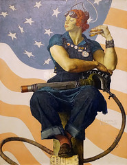
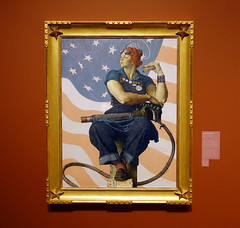
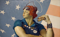
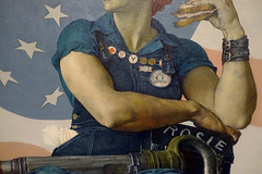
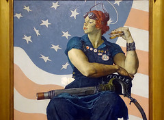
Figure \(\PageIndex{41}\): More Smarthistory images…
Selected Contributors
Seeing America is developed and distributed by Smarthistory together with a consortium of museums, including:
Amon Carter Museum of American Art
Crystal Bridges Museum of American Art
Fine Arts Museums of San Francisco
Los Angeles County Museum of Art
National Museum of the American Indian, Smithsonian Institution
Pennsylvania Academy of Fine Arts
Smithsonian American Art Museum
1948
A mine disaster and those left behind: Ben Shahn's Miner's Wives
An explosion in a mine kills 111, Shahn captures the devastation of those left behind.
A mine disaster and those left behind
Ben Shahn's Miners' Wives
by JESSICA T. SMITH, PHILADELPHIA MUSEUM OF ART and DR. BETH HARRIS
Video \(\PageIndex{13}\): Ben Shahn, Miners' Wives, c. 1948, tempera on panel, 121.9 x 91.4 cm (The Philadelphia Museum of Art) © Estate of Ben Shahn A conversation with Jessica T. Smith, Susan Gray Detweiler Curator of American Art, and Manager, Center for American Art, Philadelphia Museum of Art and Dr. Beth Harris
Test your knowledge with a quiz
Key points
- The 1947 explosion in the Centralia mine in Illinois illustrated the dangerous conditions and lack of enforced regulations in the coal mining industry. Although hazards were long known at the site, this accident, which killed 111 men, raised public awareness around mining companies’ ongoing practice of neglect. While such tragedies have sometimes led to legal reform and occupational safety regulations, they continue to be a part of the history of industrial growth in the United States.
- Social realist artists like Ben Shahn were committed to making art that would expose social problems and advocate for real change to better the lives of the working class. In this painting, he draws attention not to the dramatic events of the tragedy, but the personal impact of the death of these men on the wives and families left behind.
Go deeper
See this work in the Philadelphia Museum of Art
Watch a documentary on Ben Shahn
Read or hear about the 1947 Centralia Mine Explosion that inspired this painting
Listen to and read the lyrics from Woody Guthrie’s Dying Miner about the Centralia coal mine explosion
Read about the daily life of a coal miner’s wife in the early 20th century
See a timeline of significant changes in the history of occupational safety and health in the U.S.
More to think about
There continue to be industries and jobs that put people at risk either through occupational hazards or a lack of industrial safety measures. What can artists, the media, or other activist groups do to raise awareness and create change?
Selected Contributors
Seeing America is developed and distributed by Smarthistory together with a consortium of museums, including:
Amon Carter Museum of American Art
Crystal Bridges Museum of American Art
Fine Arts Museums of San Francisco
Los Angeles County Museum of Art
National Museum of the American Indian, Smithsonian Institution
Pennsylvania Academy of Fine Arts
Smithsonian American Art Museum
1948
Visions of the future, the 1939 New York World’s Fair
The idea of “progress” was essential to the 1939 World’s Fair, and this glass chair was upending tradition.
The Future and the 1939 World’s Fair
American Progress and a thoroughly modern chair
by DR. EMILY ORR and DR. STEVEN ZUCKER
Video \(\PageIndex{14}\): Chair, c. 1948, attributed to Henry Turchin, design direction by Louis Dierra, manufactured by the Pittsburgh Plate Glass Company (Pittsburgh, Pennsylvania, USA), slumped plate glass, metal, woven textile (Cooper Hewitt, Smithsonian Design Museum, New York City). Speakers: Dr. Emily Orr and Dr. Steven Zucker
This video was produced in cooperation with the Cooper Hewitt, Smithsonian Design Museum.
Smarthistory images for teaching and learning:

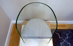


Figure \(\PageIndex{42}\): More Smarthistory images…
Selected Contributors
Seeing America is developed and distributed by Smarthistory together with a consortium of museums, including:
Amon Carter Museum of American Art
Crystal Bridges Museum of American Art
Fine Arts Museums of San Francisco
Los Angeles County Museum of Art
National Museum of the American Indian, Smithsonian Institution
Pennsylvania Academy of Fine Arts
Smithsonian American Art Museum
1962
Mass consumerism, Warhol and 1960s America
Warhol’s art celebrates the consumerism and advertising that inundated American culture in the 1960s.
Consumers, Warhol, and 1960s America
Making art from the advertising that inundated modern America
by ALEJO BENEDETTI, CRYSTAL BRIDGES MUSEUM OF AMERICAN ART and DR. STEVEN ZUCKER
Video \(\PageIndex{15}\): Andy Warhol, Coca-Cola [3], 1962, casein on canvas, 176.2 x 137.2 cm (Crystal Bridges Museum of American Art, © The Andy Warhol Foundation for the Visual Arts), a Seeing America video. Speakers: Alejo Benedetti, Crystal Bridges Museum of American Art and Dr. Steven Zucker
Test your knowledge with a quiz
Key points
- Throughout the 1950s and early 1960s, increased factory production and economic prosperity in the United States contributed to a rise in consumer culture dominated by recognizable product brands and iconic advertising images popularized through mass media.
- The widespread appeal of products like Coca-Cola suggested an ideal of American democracy where individuals shared common experiences, regardless of class or social difference.
- By imitating the style and commercial technique of mass advertising, Pop Art rejected an emphasis on the skill of the artist.
- Warhol replaced art’s traditional subject matter with images of everyday, mass produced objects.
Many post-war artists turned to the “everyday” as an antidote to capitalist conformism—as a field of spontaneity, serendipity, and freedom. But others wondered whether the American everyday had not, in fact, already been thoroughly saturated by corporate media. By the early 1960s, the post-war economic boom had progressed to the point where its commercial effects had permeated the everyday landscape with standardized objects, architectures, and media-dizzying arrangements of billboards, subway advertisements, tabloids, comic books, movie posters, and supermarket signs—and the din of televisions and radios. What would happen to the critical function of art if it were to expand so far as to include not only (to quote [Allan] Kaprow) “the odor of crushed strawberries” but also “a billboard selling Drano”? Would art simply collapse into advertising? Would commodities be reclassified as art?
From Angela L. Miller, Janet Catherine Berlo, Bryan J. Wolf, and Jennifer L. Roberts, American Encounters: Art, History, and Cultural Identity (Washington University Libraries, 2018), p. 592. CC BY-NC-SA 4.0
Go deeper
Learn more about this work from the Crystal Bridges Museum of American Art
Read about the rise of the suburbs and consumer culture in the years after World War II
Find out how consumerism helped shaped American identities in the 1950s
More to think about
The 1950s and 1960s witnessed a dramatic increase in consumer culture and advertising imagery. Warhol’s Coca-Cola [3] incorporates both the subject and the style of these new images, but is this painting critical or celebratory of this “culture of excess”? What are the arguments for both positions?
Smarthistory images for teaching and learning:


Figure \(\PageIndex{43}\): More Smarthistory images…
Selected Contributors
Seeing America is developed and distributed by Smarthistory together with a consortium of museums, including:
Amon Carter Museum of American Art
Crystal Bridges Museum of American Art
Fine Arts Museums of San Francisco
Los Angeles County Museum of Art
National Museum of the American Indian, Smithsonian Institution
Pennsylvania Academy of Fine Arts
Smithsonian American Art Museum
1971
Disillusionment in 1970s America
Museum visitors often mistake this sculpture for a real person
Disillusionment in 1970s America
Is he real? Duane Hanson's Executive
by DR. HALONA NORTON-WESTBROOK, TOLEDO MUSEUM OF ART and DR. STEVEN ZUCKER
Video \(\PageIndex{16}\): Duane Hanson, Executive, originally titled, Another Day, 1971, polyester resin and fiberglass, oil paint, mixed media with accessories, life size (Toledo Museum of Art, © estate of the artist). Speakers: Dr. Halona Norton-Westbrook, Toledo Museum of Art and Dr. Steven Zucker
Test your knowledge with a quiz
Key Points
- Amid rapid social changes, Vietnam War protests, debates on gender roles, and civil rights, the stability of middle class American life during the 1950s gave way to a period of disillusionment and uncertainty by the 1970s.
- In this highly realistic sculpture, Duane Hanson creates an archetypical businessman, physically rooted in the dress and style of the early 1970s, and uses his posture and body to conjure the mental and emotional turmoil of the period. It is both a highly specific and universal image of midlife burdens and exhaustion.
Go deeper
This sculpture at the Toledo Museum of Art
Learn more about The Organization Man and its author, William Whyte
Read about the social turmoil of the 1960s
Explore more of Duane Hanson’s work
Learn about the rise of suburbs and the “Organization Man” through primary source documents
Read about youth culture and the antiwar movement in the 1960s
More to think about
Duane Hanson’s Executive was originally commissioned for the lobby of an office building. How do you think seeing the work in that space would be different than seeing it today in a museum?
Smarthistory images for teaching and learning:




Figure \(\PageIndex{44}\): More Smarthistory images…
Selected Contributors
Seeing America is developed and distributed by Smarthistory together with a consortium of museums, including:
Amon Carter Museum of American Art
Crystal Bridges Museum of American Art
Fine Arts Museums of San Francisco
Los Angeles County Museum of Art
National Museum of the American Indian, Smithsonian Institution
Pennsylvania Academy of Fine Arts
Smithsonian American Art Museum
1992
“That’s the deal you gave us,” trade myths and native land
Smith created this in 1992, responding to the 500th anniversary of Christopher Columbus’s arrival in North America.
Trade myths and native land
Jaune Quick-to-See Smith on Columbus, an indigenous perspective
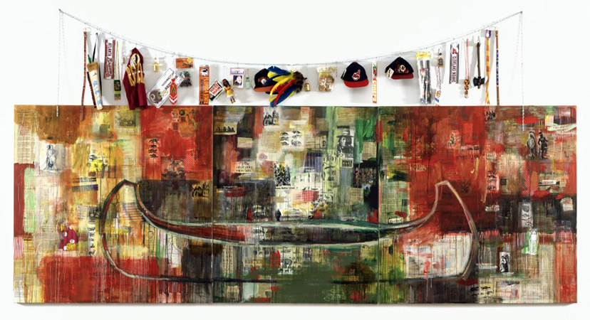
Figure \(\PageIndex{45}\): Jaune Quick-to-See Smith, Trade (Gifts for Trading Land with White People), 1992, oil paint and mixed media, collage, objects, canvas, 152.4 x 431.8 cm (Chrysler Museum of Art, Norfolk, Virginia) © Jaune Quick-to-See Smith
A Non-Celebration
As a response to the 500th anniversary of Christopher Columbus’ arrival in North America in 1992, the artist Jaune Quick-to-See Smith, from the Confederated Salish and Kootenai Tribes of the Flathead Indian Nation, created a large mixed-media canvas called Trade (Gifts for Trading Land with White People). Trade, part of the series “The Quincentenary Non-Celebration,” illustrates historical and contemporary inequities between Native Americans and the United States government.
Trade references the role of trade goods in allegorical stories like the acquisition of the island of Manhattan by Dutch colonists in 1626 from unnamed Native Americans in exchange for goods worth 60 guilders or $24.00. Though more apocryphal than true, this story has become part of American lore, suggesting that Native Americans had been lured off their lands by inexpensive trade goods. The fundamental misunderstanding between the Native and non-Native worlds—especially the notion of private ownership of land—underlies Trade. Smith stated that if Trade could speak, it might say: “Why won’t you consider trading the land we handed over to you for these silly trinkets that so honor us? Sound like a bad deal? Well, that’s the deal you gave us.”1

Figure \(\PageIndex{46}\): Jaune Quick-to-See Smith, canoe (detail), Trade (Gifts for Trading Land with White People), 1992, oil paint and mixed media, collage, objects, canvas, 152.4 x 431.8 cm (Chrysler Museum of Art, Norfolk, Virginia) © Jaune Quick-to-See Smith
For Trade, Smith layered images, paint, and objects on the surface of the canvas, suggesting layers of history and complexity. Divided into three large panels, the triptych (three part) arrangement is reminiscent of a medieval altarpiece. Smith covered the canvas in collage, with newspaper articles about Native life cut out from her tribal paper Char-Koosta, photos, comics, tobacco and gum wrappers, fruit carton labels, ads, and pages from comic books, all of which feature stereotypical images of Native Americans. She mixed the collaged text with photos of deer, buffalo, and Native men in historic dress holding pipes with feathers in their hair, and an image of Ken Plenty Horses—a character from one of Smith’s earlier pieces, the Paper Dolls for a Post Columbian World with Ensembles Contributed by US Government from 1991-92.

Figure \(\PageIndex{47}\): Jaune Quick-to-See Smith, toys and souvenirs (detail), Trade (Gifts for Trading Land with White People), 1992, oil paint and mixed media, collage, objects, canvas, 152.4 x 431.8 cm (Chrysler Museum of Art, Norfolk, Virginia) © Jaune Quick-to-See Smith
She applied blocks of white, yellow, green, and especially red paint over the layer of collaged materials. The color red had multiple meanings for Smith, referring to her Native heritage as well as to blood, warfare, anger, and sacrifice. With the emphasis on prominent brushstrokes and the dripping blocks of paint, Smith cited the Abstract Expressionist movement from the 1940s and 50s with raw brushstrokes describing deep emotions and social chaos. For a final layer, she painted the outline of an almost life-sized canoe. Canoes were used by Native Americans as well as non-Native explorers and traders in the eighteenth, nineteenth and early twentieth century to travel along the waterways of North America. The canoe suggests the possibility of trade and cultural connections—though this empty canoe is stuck, unable to move.

Figure \(\PageIndex{48}\): Jaune Quick-to-See Smith, toys and souvenirs (detail), Trade (Gifts for Trading Land with White People), 1992, oil paint and mixed media, collage, objects, canvas, 152.4 x 431.8 cm (Chrysler Museum of Art, Norfolk, Virginia) © Jaune Quick-to-See Smith
Above the canvas, Smith strung a clothesline from which she dangled a variety of Native-themed toys and souvenirs, especially from sports teams with Native American mascots. The items include toy tomahawks, a child’s headdress with brightly dyed feathers, Red Man chewing tobacco, a Washington Redskins cap and license plate, a Florida State Seminoles bumper sticker, a Cleveland Indian pennant and cap, an Atlanta Braves license plate, a beaded belt, a toy quiver with an arrow, and a plastic Indian doll. Smith offers these cheap goods in exchange for the lands that were lost, reversing the historic sale of land for trinkets. These items also serve as reminders of how Native life has been commodified, turning Native cultural objects into cheap items sold without a true understanding of what the original meanings were.
The Artist
The artist was born on January 15, 1940, at the St. Ignatius Jesuit Missionary on the Reservation of the Flathead Nation. Raised by her father, a rodeo rider and horse trader, Smith was one of eleven children. Her first name comes from the French word for “yellow” (jaune), a reminder of her French-Cree ancestors. Her middle name “Quick-to-See” was not a reference to her eyesight but was given by her Shoshone grandmother as a sign of her ability to grasp things readily. From an early age Smith wanted to be an artist; as a child, she had herself photographed while dressed as Henri de Toulouse-Lautrec. Though her father was not literate, education was important to Smith.

Figure \(\PageIndex{49}\): National Bison Range (near St. Ignatius, Flathead Reservation) (photo: Jaix Chaix, Check All Home Inspection Corp., CC BY-SA 2.0)
She received a bachelor of arts from Framingham State College in Massachusetts in 1976 in art education rather than in studio art because her instructors told her that no woman could have a career as an artist, though they acknowledged that she was more skilled than the men in her class. In 1980 she received a master of fine arts from the University of New Mexico. She was inspired by both Native and non-Native sources, including petroglyphs, Plains leger art, Diné saddle blankets, early Charles Russell prints of western landscapes, and paintings by twentieth-century artists such as Paul Klee, Joan Miró, Willem DeKooning, Jasper Johns, and especially Kurt Schwitters and Robert Rauschenberg (see image below). Both Schwitters and Rauschenberg brought objects from the quotidian world into their work, such as tickets, cigarette wrappers, and string.
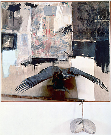
Figure \(\PageIndex{50}\): Robert Rauschenberg, Canyon, 1959, oil, pencil, paper, metal, photograph, fabric, wood, canvas, buttons, mirror, taxidermied eagle, cardboard, pillow, paint tube and other materials, 207.6 x 177.8 x 61 cm (The Museum of Modern Art, New York) © 2014 Robert Rauschenberg Foundation
In addition to her work as an artist, Smith has curated over thirty exhibitions to promote and highlight the art of other Native artists. She has also lectured extensively, been an artist-in-residence at numerous universities, and has taught art at the Institute of American Indian Arts in Santa Fe, New Mexico the only four-year university dedicated to teaching Native youth across North America. In her years as an artist, Smith has received many honors, including an Eitelijorg Fellowship in 2007, a grant from the Joan Mitchell Foundation to create a comprehensive archive of her work, a Lifetime Achievement Award from the Women’s Caucus for the Arts, the College Art Association’s Committee on Women in the Arts award, the 2005 New Mexico Governor’s award for excellence in the arts, as well as four honorary doctorate degrees.
Smith’s art shares her view of the world, offering her personal perspective as an artist, a Native American, and a woman. Her work creates a dialogue between the art and its viewers and explores issues of Native identity as it is seen by both Native Americans and non-Natives. Trade (Gifts for Trading Land with White People) restates the standard narratives of the history of the United States, specifically the desire to expand beyond “sea to shining sea,” as encompassed in the ideology of Manifest Destiny (the belief in the destiny of Western expansion), and raises the issue of contemporary inequities that are rooted in colonial experience.
1. Arlene Hirschfelder, Artists and Craftspeople, American Indian Lives, New York: Facts On File, 1994, page 115.
Go deeper
Jaune Quick-to-See Smith at the Smithsonian American Art Museum
“Smith, Jaune Quick-to-See” in American Indian History Online
Lawrence Abbot, I Stand in the Center of the Good: Interviews with Contemporary Native American Artists, University of Nebraska Press: Lincoln, 1994.
Carolyn Kastner, Jaune Quick-to-See Smith: An American Modernist, University of New Mexico Press: Albuquerque, 2013.
Melanie Herzog, “Building Bridges Across Canada: Jaune Quick-to-See Smith.” School Arts (October 1992): 31–34.
Tricia Hurst, “Crossing Bridges: Jaune Quick-to-See Smith, Helen Hardin, Jean Bales.” Southwest Art, April 1981, 82–91.
Tricia Hurst, ”Jaune Quick-to-See Smith,” January 17–March 14, 1993. Norfolk, Virginia: Chrysler Museum, 1993.
Joni L. Murphy, “Beyond Sweetgrass: The Life and Art of Jaune Quick-To-See Smith.” Ph.D. dissertation. University of Kansas, 2008.
Selected Contributors
Seeing America is developed and distributed by Smarthistory together with a consortium of museums, including:
Amon Carter Museum of American Art
Crystal Bridges Museum of American Art
Fine Arts Museums of San Francisco
Los Angeles County Museum of Art
National Museum of the American Indian, Smithsonian Institution
Pennsylvania Academy of Fine Arts
Smithsonian American Art Museum
1995
Television nation—Nam June Paik, Electronic Superhighway
The “father of video art” argued that electronic communication, not transportation, unites the modern world.
Television nation
Nam June Paik's Electronic Superhighway
Video \(\PageIndex{17}\)
Getting on the “Electronic Super Highway”
In 1974, artist Nam June Paik submitted a report to the Art Program of the Rockefeller Foundation, one of the first organizations to support artists working with new media, including television and video. Entitled “Media Planning for the Post Industrial Society—The 21st Century is now only 26 years away,” the report argued that media technologies would become increasingly prevalent in American society, and should be used to address pressing social problems, such as racial segregation, the modernization of the economy, and environmental pollution. Presciently, Paik’s report forecasted the emergence of what he called a “broadband communication network”—or “electronic super highway”—comprising not only television and video, but also “audio cassettes, telex, data pooling, continental satellites, micro-fiches, private microwaves and eventually, fiber optics on laser frequencies.” By the 1990s, Paik’s concept of an information “superhighway” had become associated with a new “world wide web” of electronic communication then emerging—just as he had predicted.
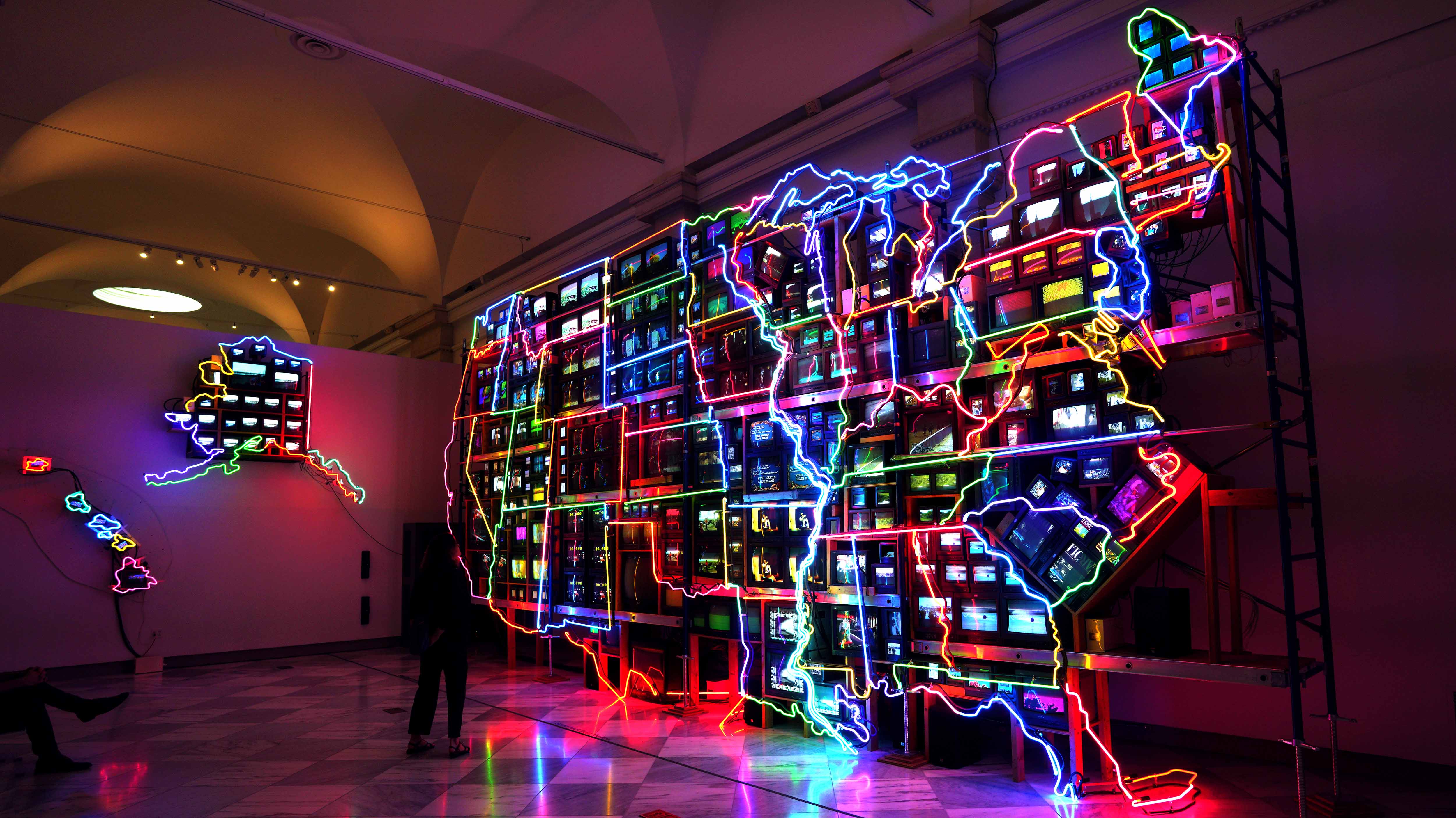
Figure \(\PageIndex{51}\): Nam June Paik, Electronic Superhighway: Continental U.S., Alaska, Hawaii, 1995, fifty-one channel video installation (including one closed-circuit television feed), custom electronics, neon lighting, steel and wood; color, sound, roughly 15 x 40 x 4′ (Smithsonian American Art Museum, © Nam June Paik Estate)
From Music to Fluxus
Paik was well-positioned to understand how media technologies were evolving: in the 1960s he was one of the very first people to use televisual technologies as an artistic medium, earning him the title of “father” of video art. Born in Seoul in 1932, Paik studied composition while attending college in Tokyo; he eventually travelled to Germany, where he hoped to encounter the leading composers of the day. He met John Cage in 1958, and soon became involved with the avant-garde Fluxus group, led by Cage’s student George Maciunas. Explain Fluxus.
Following the example of Cage’s oeuvre, many of Paik’s Fluxus works undermined accepted notions of musical composition or performance. This same irreverent spirit informed his use of television, to which he turned his attention in 1963 in his first one-man gallery show, “Exposition of Music—Electronic Television,” at the Galerie Parnass in Wuppertal, Germany. Here, Paik became the first artist to exhibit what would later become known as “video art” by scattering television sets across the floor of a room, thereby shifting our attention from the content on the screens to the sculptural forms of the sets.
The father of video art

Figure \(\PageIndex{52}\): Nam June Paik, Magnet TV, 1965, modified black-and-white television set and magnet (Smithsonian American Art Museum) (© Nam June Paik Estate)
Paik moved to New York in 1964, where he came into contact with the downtown art scene. In 1965, he began collaborating with cellist Charlotte Moorman, who would wear and perform Paik’s TV sculptures for many years; he also had a one-man show at the 57th Street Galeria Bonino, in which he exhibited modified or “prepared” television sets that upset the traditional TV-watching experience. One example is Magnet TV, in which an industrial magnet is placed on top of the TV set, distorting the broadcast image into abstract patterns of light.
According to an oft-cited story, on October 4th of that same year, Paik purchased the first commercially-available portable video system in America, the Sony Portapak, and immediately used it to record the arrival of Pope Paul VI at St. Patrick’s Cathedral. Later that night, Paik showed the tape at the Café au Go Go in Greenwich Village, ushering in a new mode of video art based not on the subversion or distortion of television broadcasts, but on the possibilities of videotape. The evolution of these tendencies into a new movement was announced by a 1969 group show, “TV as a Creative Medium.” Held at the Howard Wise Gallery in New York, the show included one of Paik’s interactive TVs, and also premiered another one of his collaborations with Moorman.
TV as a Creative Medium
For Paik and other early adopters of video, this new artistic medium was well-suited to the speed of our increasingly electronic modern lives. It allowed artists to create moving images more quickly than recording on film (which required time for negatives to be developed), and unlike film, video could be edited in “real-time,” using devices that altered the video’s electronic signals. (Ever the pioneer, Paik created his own video synthesizer with engineer Shuya Abe in 1969.) Furthermore, because the image recorded by the video camera could be transmitted to and viewed almost instantaneously on a monitor, people could see themselves “live” on a TV screen, and even interact with their own TV image, in a process known as “feedback.” In the years to come, the participatory nature of TV would be redefined by two-way cable networks, while the advent of global satellite broadcasts made TV a medium of instant global communication.

Figure \(\PageIndex{53}\): Nam June Paik, TV Garden, 1974 (image shows 2000 version), video installation with color television sets and live plants (Solomon R. Guggenheim Museum) (© Nam June Paik Estate)
As television continued to evolve from the late 1960s onward, Paik explored ways to disrupt it from both inside and outside of the institutional frameworks of galleries, museums, and emerging experimental TV labs. His major works from this period include TV Garden (1974), a sculptural installation of TV sets scattered among live plants in a museum (image above), and Good Morning, Mr. Orwell (1984), a broadcast program that coordinated live feeds from around the world via satellite. In these and other projects, Paik’s goal was to reflect upon how we interact with technology, and to imagine new ways of doing so. The many retrospectives of his work in recent decades, including one organized by the Smithsonian American Art Museum in 2012, speak to the increasing relevance of his ideas for contemporary art.
The nation electric

Figure \(\PageIndex{54}\): Nam June Paik, V-yramid (detail), 1982, video installation, color, sound, with forty television sets (Whitney Museum of American Art, New York) (photo: Mark B. Schlemmer, CC BY 2.0) (© Nam June Paik Estate)
By the 1980s, Paik was building enormous, free-standing structures comprising dozens or even hundreds of TV screens, often organized into iconic shapes, as in the giant pyramid of V-yramid (1982). For the German Pavilion at the 1993 Venice Biennale, Paik produced a series of works about the relationship between Eastern and Western cultures, framed through the lens of Marco Polo; along with Hans Haacke, another artist representing Germany, Paik was awarded the prestigious Golden Lion. One of the works, Electronic Superhighway, was a towering bank of TVs that simultaneously screened multiple video clips (including one of John Cage) from a wide variety of sources. Two years later, Paik revisited this work in Electronic Superhighway: Continental U.S., Alaska, Hawaii, placing over 300 TV screens into the overall formation of a map of the United States outlined in colored neon lights (see image at the top of the page and the detail below). Roughly forty feet long and fifteen feet high, the work is a monumental record of the physical and also cultural contours of America: within each state, the screens display video clips that resonate with that state’s unique popular mythology. For example, Iowa (where each presidential election cycle begins) plays old news footage of various candidates, while Kansas presents the Wizard of Oz.

Figure \(\PageIndex{55}\): Detail, Nam June Paik, Electronic Superhighway: Continental U.S., Alaska, Hawaii, 1995, fifty-one channel video installation (including one closed-circuit television feed), custom electronics, neon lighting, steel and wood; color, sound, approx. 15 x 40 x 4′ (Smithsonian American Art Museum) (© Nam June Paik Estate)
The states are firmly defined, but also linked, by the network of neon lights, which echoes the network of interstate “superhighways” that economically and culturally unified the continental U.S. in the 1950s. However, whereas the highways facilitated the transportation of people and goods from coast to coast, the neon lights suggest that what unifies us now is not so much transportation, but electronic communication. Thanks to the screens of televisions and of the home computers that became popular in the 1990s, as well as the cables of the internet (which transmit information as light), most of us can access the same information at anytime and from any place. Electronic Superhighway: Continental U.S., Alaska, Hawaii, which has been housed at the Smithsonian American Art Museum since 2002, has therefore become an icon of America in the information age.
While Paik’s work is generally described as celebrating the fact that the “electronic superhighway” allows us to communicate with and understand each other across traditional boundaries, this particular work also can be read as posing some difficult questions about how that technology is impacting culture. For example, the physical scale of the work and number of simultaneous clips makes it difficult to absorb any details, resulting in what we now call “information overload,” and the visual tension between the static brightness of the neons and the dynamic brightness of the screens points to a similar tension between national and local frames of reference.
Test your knowledge with a quiz
Key points
- As technology created new connections between people and places, it became clear that communications and information sharing was changing radically. Even before the internet, phrases like the “electronic superhighway” or “information superhighway” were used to describe the new speed of exchange.
- In the mid-1970s, Nam June Paik was one of the first artists to foresee the impact of developing media technologies, believing this new connectivity had the potential to address social issues. In his Electronic Superhighway, however, this abundance of information and intense network also create an overwhelming visual field, making it almost impossible to focus on any one component. In the internet era, this is often referred to as “information overload.”
- Paik’s work blends the functional and sculptural qualities of his monitors, combining elements of movement within a static, permanent arrangement. Such works in time-based media pose special challenges to museums as technology changes and hardware deteriorates. As the screens are replaced, choices must be made as to whether it is more important to preserve the way the original object looked or the way it was intended to perform.
Go deeper
Nam June Paik, bio and collection of the Smithsonian American Art Museum
Nam June Paik, TV Garden at the Guggenheim
Nam June Paik from the National Endowment for the Arts
Nam June Paik archive at the Smithsonian American Art Museum
Nam June Paik from the Asia Society
Learn more about the history of video art
Watch a news report on the internet from 1993
Read an instructional booklet on the Information Superhighway, written in 1997
Electronic Superhighway – American Experience in the Classroom (The Smithsonian American Art Museum)
Melissa Chiu and Michelle Yun, eds., Nam June Paik: Becoming Robot (New York: Asia Society Museum, 2014).
John G. Hanhardt and Ken Hakuta, Nam June Paik: Global Visionary (Washington, D.C.: Smithsonian American Art Museum, 2012).
John G. Hanhardt and Jon Ippolito, The Worlds of Nam June Paik (New York: Guggenheim Museum, 2000).
More to think about
In Electronic Superhighway, Nam June Paik selects the video footage for each state based on his own connection or understanding of that place. Sometimes, his choices are iconic (like showing The Wizard of Oz in Kansas) and sometimes they are personal and more difficult for outsiders to understand (for example, the composer John Cage, who was a friend and artistic influence on Paik, is shown in Massachusetts). Why do you think he mixed sources like this and what is the impact of this mixture on the viewer? What images would you include to characterize each state? Explain the reason for your choices.
Selected Contributors
Seeing America is developed and distributed by Smarthistory together with a consortium of museums, including:
Amon Carter Museum of American Art
Crystal Bridges Museum of American Art
Fine Arts Museums of San Francisco
Los Angeles County Museum of Art
National Museum of the American Indian, Smithsonian Institution
Pennsylvania Academy of Fine Arts
Smithsonian American Art Museum
2001
The landscape remade—Thiebaud, Ponds and Streams
Can the commonplace working farmland of California's Sacramento River Valley be a place of of breathtaking beauty?
The landscape remade
Wayne Thiebaud's Ponds and Streams, agriculture, and pollution
by DR. LAUREN PALMOR, FINE ARTS MUSEUMS OF SAN FRANCISCO and DR. STEVEN ZUCKER
Video \(\PageIndex{18}\): Wayne Thiebaud, Ponds and Streams, 2001, acrylic on canvas, 182.9 x 152.4 cm (Fine Arts Museums of San Francisco, ©Wayne Thiebaud), a Seeing America video. Speakers: Dr. Lauren Palmor, Fine Arts Museums of San Francisco and Dr. Steven Zucker
Test your knowledge with a quiz
Key points
- Wayne Thiebaud uses unnatural colors, strong contrasts, and an unconventional sense of perspective to paint a landscape that is beautiful, but also distant from the natural world. This modern landscape is man-made and artificial, but also presents us with a type of constructed beauty.
- The Sacramento River valley is the most productive agricultural region in America, despite its naturally arid conditions. The landscape has been significantly altered and controlled in order to provide water to these farms. These interventions have led to episodes of water pollution in a heavily populated area. In recent years, drought has also become an important issue.
- Landscape painting has a long tradition in the United States often characterized by a nostalgia for the landscape before its settlement and development.
Go deeper
View and read about this painting at the Fine Arts Museums of San Francisco
Explore the history of the Sacramento region through primary source documents
Read about the environmental issues facing the Sacramento River valley
Learn more about the Sacramento River valley
Find out about the top 5 pieces of environmental legislation in the U.S.
Watch a video of Wayne Thiebaud or read more about his work
Learn about the development of landscape painting in the United States
More to think about
Bolthouse [an industrial farm in the Central Valley] processes six million pounds of carrots a day. If you took its yield from one week and stacked each carrot from end to end, you could circle the earth. If you took all the carrots the company grows in a year, they would double the weight of the Empire State Building….At Bolthouse’s complex, carrots whirl around on conveyor belts at up to 50 miles an hour en route to their future as juliennes, coins and stubs, or baby carrots, which the company popularized and which aren’t babies.
— Mark Bittman, “Everyone Eats There,” The New York Times (October 10, 2012)
Given this reality, why do you think that so many Americans persist in imagining farms as quaint small family operations? Does Thiebaud’s painting make you think differently about the modern agricultural landscape?
Smarthistory images for teaching and learning:


Figure \(\PageIndex{56}\): More Smarthistory images…
Selected Contributors
Seeing America is developed and distributed by Smarthistory together with a consortium of museums, including:
Amon Carter Museum of American Art
Crystal Bridges Museum of American Art
Fine Arts Museums of San Francisco
Los Angeles County Museum of Art
National Museum of the American Indian, Smithsonian Institution
Pennsylvania Academy of Fine Arts
Smithsonian American Art Museum
This page titled 13.2: Work, exchange, and technology was last modified on Mon, 04 Oct 2021 15:49:38 GMT and is shared under a CC BY-NC-SA 4.0 license and was authored, remixed, and/or curated by Smarthistory.
The book could not be loaded just now.