Opening the book…
Interactive colour wheel and colour relationships
Instructions for using this colour wheel (Figure 3.64)
- Choose a colour scheme from the drop-down list and drag the circles around the colour wheel to create your own palette of colour relationships.
- You can change the saturation or intensity of a hue by moving the circles closer to or further from the centre of the circle.
- You can also change the shade of the colour with the sliders at the bottom of the wheel to create a darker value of the same hue.
- Colours are shown as Hexadecimal values in this wheel. You can use these values in most image editing software applications.
**** blank figure***
Colour relationships and schemes
The interactive colour wheel in Figure 3.64 has a selection of colour schemes that you can use to create harmonious and vibrant colour relationships and palettes.
Here are definitions of these schemes:

Monochrome
A monochromatic colour scheme contains a single colour hue with varying shades and tints, which are darker and lighter colours of the same hue (see Properties of colour in this resource for more about shades, tints and tones)
Figure 3.65. Colour wheel diagram showing monochrome colours. Image attribution: see attribution at the bottom of this page.

Analogous
An analogous colour scheme contains one main hue (colour) with the colours on either side of it on the colour wheel. For a five-colour scheme, it may also contain the two adjacent colours on the colour wheel.
Colour Bias is also related to analogous colour. This term refers to the way that a colour may be biased towards another adjacent colour on the colour wheel – for example, you may have a red hue that has an orange colour bias or a purple colour bias and is not a pure “red” colour. In fact, many pigments we think of as primary or “pure” colours actually have a colour bias and are not pure spectrum colours.
Figure 3.66. Colour wheel diagram showing analogous colour hues. Image attribution: see attribution at the bottom of this page.
Complementary
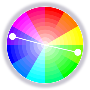
A complementary colour scheme contains the two colour hues directly opposite each other on the colour wheel.
Figure 3.67. Colour wheel diagram showing complementary colour hues. Image attribution: see attribution at the bottom of this page.
Split-complementary
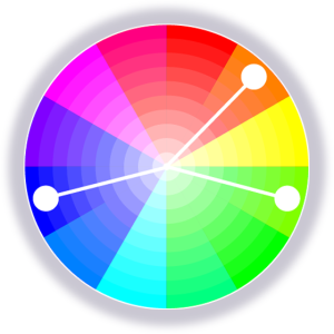
A split-complementary scheme includes one dominant colour hue and two hues on either side of the dominant colour’s complementary hue.
Figure 3.68. Colour wheel diagram showing split-complementary colour hues. Image attribution: see attribution at the bottom of this page

Triadic
A triadic colour scheme has three colour hues that are equally spaced around the colour wheel, forming a triangle shape.
Figure 3.69. Colour wheel diagram showing triadic colour hues. Image attribution: see attribution at the bottom of this page.
Tetradic
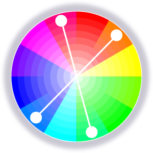
A tetradic colour scheme has four hues that form a rectangle within the colour wheel. There is also a quadratic scheme where the four hues form a square that is more evenly spaced than the tetradic rectangle, which could be any rectangular shape.
Figure 3.70. Colour wheel diagram showing tetradic colour hues. Image attribution: see attribution at the bottom of this page.
See Colour trends and palettes in this resource for a selection of colour palette generators.
The Dimensions of Colour Today: ICD 2022 (David Briggs)
This video is a recording of a talk by David Briggs, who is an Australian authority on colour theory. He bases the talk on content from his website The Dimensions of Colour , highlighting some developments in how we understand colour and colour relationships. He gives an overview of the alternative frameworks available today for visualising colour relationships. It is an academic video, but the imagery and diagrams make these complex concepts easier to understand. The YouTube page also contains links to all the resources and tools he references in the video. (34 minutes)
Media attribution: ICD 2022: The Dimensions of Colour Today (David Briggs), Colour Society of Australia NSW Division on YouTube
Image attributions for this page: Colour wheel images on this page (figures 3.65 to 3.70) by RMIT, CC BY-NC 4.0.
Properties of colours
This page contains simple definitions of the basic properties or attributes of colours of objects and colours of light, which are useful to understand if you are working with colour applications and developing colour relationships or palettes. For further information, refer to The Elements of Colour by DJC Briggs[1], which provides a detailed illustrated account of these attributes including their scientific definitions.
Hue
Hue is a term that we use to classify colours of objects and colours of light into families that vary in other colour properties. The hue of any colour is the most similar pure colour around the colour wheel, such as red, or magenta, or greenish yellow. (“Pure” in this context means lacking perceived white, black, or grey content, as described in Tints, Shades and Tones below). So, for example, we might say that the hue of a brown wooden table is orange or yellow orange.

Figure 3.71. Hue colour wheel by RMIT, CC BY-NC 4.0
For a light, Hue is our perception of the dominant part or parts of the visible spectrum. For an object, Hue is our perception of the dominant spectral reflectance of the object.
(For “spectral reflectance”, see Why are things different colours?).
When we describe a light or an object as being “coloured”, we generally mean that it exhibits hue, and yet we may include black, white and grey, which lack hue, as “colours” in a practical sense – for example, when referring to paints or fabrics. Black, white, and grey are classified scientifically as “achromatic colours” [2], as opposed to “chromatic colours”, which exhibit hue.
Chroma and Saturation
Many people use Chroma and Saturation to mean the same thing, but according to the CIE International Lighting Vocabulary [3] they have different definitions that correspond to different aspects of colour intensity.

Figure 3.72. Saturation colour wheel by RMIT, CC BY-NC 4.0. The colours decrease in both Saturation and Chroma towards the centre of the circle. (Compare Figure 3.75 below, the shades colour wheel, where the colours decrease in Chroma towards the centre but stay high in Saturation).
Chroma applies specifically to colours perceived as belonging to objects, and is the absolute intensity of an object’s colour, that is, the amount of difference from a grey of the same Value. In Figure 3.A, Chroma is represented by increasing distance to the right, beginning at zero for black, white and grey. In a colour wheel like Figure 3.72 the relatively “pure” colours on the circumference have the highest Chroma for their hue. However, the possible maximum Chroma varies greatly for different paints, inks and digital colours, and is not the same for different hues, and so distance from the centre in a symmetrical colour wheel like this normally shows relative rather than absolute Chroma.
Saturation on the other hand applies both to colours of light and colours of objects and is the intensity of colour (called Colourfulness; see below) of a light relative to its Brightness, or the intensity of colour (Chroma) of an object relative to its Value. An achromatic light or object exhibits zero saturation, a light exhibiting high saturation is perceived to consist of a relatively high proportion of coloured light to white light, and an object exhibiting high saturation is perceived to reflect/ transmit light of this character to the eye. The colours on the circumference of Figure 3.72 exhibit high Saturation (as well as Chroma), but so do darker colours that are high in Chroma for their Value (seen in Figure 3.75 below). “For an object to have high chroma it must reflect/ transmit saturated light in relatively large amounts.” [4].

Figure 3.72a. Left swatches in a column from a Munsell hue page exhibit uniform chroma but increasing Saturation going down the column. Middle: swatches exhibiting uniform Saturation, including those similar to image areas A, B and C in the image of the cube to the right, are arranged along lines that radiate from near (actually one value step below) zero on the value scale. Right: areas A to C are depicted using digital colours of uniform hue angle H and “Saturation” S in the colour space HSB. Image provided courtesy of D.J.C Briggs, 2017 CC BY-NC 4.0.
Value/lightness and value/greyscale
Value, greyscale value and lightness are alternative names for the same property of colour. The Value of a colour is the most similar or least contrasting grey on a scale between black and white (Figure 3.73). In Figure 3.A, Value is represented by horizontal level within the diagram.
Like Chroma, Value applies specifically to colours perceived as belonging to objects. Value is our perception of the proportion of the light falling on an object that the object reflects. For example, a dark green object reflects less light and therefore has a lower value than a pale green object.
In a painting or a photograph, Value helps us greatly to identify objects as three-dimensional by representing the variations in light and shade on objects.

Figure 3.73. Value colour wheel and same wheel converted to greyscale with the same values, by RMIT, CC BY-NC 4.0.
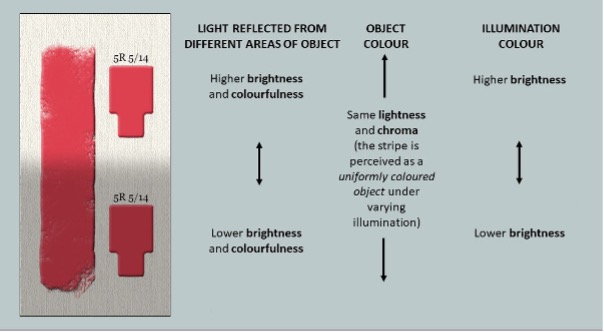
Figure 3.73a Digital painting of a stripe of red paint passing between different intensities of the same illumination, showing relationship of attributes of the colour perceived as belonging to the red stripe, and attributes of the colours of the light reaching our eyes from different areas of the stripe and of the light perceived to be falling on the stripe (the illumination)[5], from David Briggs’ presentation “Colours of objects and Colours of Light”. Image provided courtesy of D.J.C. Briggs, 2017 CC BY-NC 4.0.
Brightness and Colourfulness
Brightness and Colourfulness are properties of colours we perceive as belonging to light, including the light reflected, transmitted or emitted to our eyes by objects, and the light falling on objects (the illumination). Brightness is our perception of the amount of light, and colourfulness is our perception of its intensity of colour. In contrast to colours of objects, which we saw can be described in terms of Hue, Value and Chroma (Chroma can often be called “Saturation”), colours of light can be described in terms of Hue, Brightness, and either Saturation in the scientific sense described above or Colourfulness.
A uniform object under varying intensities of the same illumination will normally be perceived as having a uniform colour belonging to it (uniform Hue, Value and Chroma), while the light reaching our eyes from different areas of the object varies in Brightness and Colourfulness (Figure 3.73a). These variations in Brightness and Colourfulness are perceived as being imposed by the illumination rather than as belonging to the object itself. Illumination can also be perceived to exhibit Hue, Brightness and Colourfulness/Saturation, though the illumination in Figure 3.73a is perceived to be achromatic (white), varying only in Brightness.
Blackness, Chromaticness and Brilliance
A different way to classify colours of objects, besides Hue, Value and Chroma, is according to their degree of resemblance to a pure black, a pure white and a pure colour. This is the basis of the Scandinavian Natural Colour System (NCS), in which these resemblances are taken to add up to 100 and plotted on a triangular diagram for each hue (Figure 3.Z, left), and colours of objects are specified by their resemblances to pure black and pure colour, called Blackness and Chromaticness respectively.
Colours of zero blackness, between a perceptually pure colour and white, lie near the approximate upper limit of commonly encountered colours of objects. As swatches increase in brightness beyond this limit, they take on the appearance of physical fluorescence, called Fluorence, and ultimately appear as self-luminous Illuminant colours. The scale of colour appearance from black through decreasing Blackness to zero Blackness, followed by Fluorence and then Luminosity is called “Brilliance” [6].

Figure 3.73b Diagrammatic subdivision of a hue page according to Blackness and Chromaticness (degree of resemblance to pure black and to pure chromatic colour respectively), showing relationship to Fluorent and Illuminant colours, and the scale of Brilliance [7]. Image provided courtesy of D.J.C. Briggs, 2017 CC BY-NC 4.0.
Tint
In traditional colour theory, the term “Tint” may be used for colours between a pure colour or “Hue” and white, or for physical mixtures of a coloured paint and white paint. In the first sense a Tint has the same hue as the pure colour and is between that colour and white in Value and Chroma. In the second sense, Tints may shift in Hue and pass through higher Chromas than the coloured paint.

Figure 3.74. Tints colour wheel by RMIT, CC BY-NC 4.0.
Shade
In traditional colour theory, the term “Shade” may be used for colours between a pure colour or “Hue” and black, or for physical mixtures of a coloured paint and black paint. In the first sense a Shade has the same Hue as the pure colour and is between that colour and black in Value and Chroma. In the second sense, Shades may shift in Hue compared to the coloured paint.

Figure 3.75. Shades colour wheel by RMIT, CC BY-NC 4.0.
Tone
In traditional colour theory, the term “Tone” may be used for colours between a pure colour or “Hue” and grey, or for physical mixtures of a coloured paint and grey paint. In the first sense a Tone has the same Hue as the pure colour and is between that colour and black in Chroma. In the second sense, Shades may shift in Hue compared to the coloured paint. The term “Tone” is also used in some countries as an alternative name for Value/Lightness.

Figure 3.76. Tones colour wheel by RMIT, CC BY-NC 4.0.
- 1. Briggs, D.J.C., 2023. “The Elements of Colour”, Part One, https://aic-color.org/resources/Documents/jaic_v33_06.pdf and Part Two, https://aic-color.org/resources/Documents/jaic_v33_07.pdf. For additional illustrations and animations please see the related video presentations “The Elements of Colour”, https://www.youtube.com/watch?v=AtrRpGb-7FU, and “Colours of Objects and Colours of Light”, https://www.youtube.com/watch?v=ii9dWIG9nOY. accessed 03/01/2023
- CIE, 2022, achromatic colour definition - also known as "perceived colour devoid of hue", https://cie.co.at/eilvterm/17-22-049
- CIE 2023, International Lighting Vocabulary http://www.cie.co.at/ accessed 05/11/2023
- Briggs, D.J.C., 2018. “The Difference Between Chroma and Saturation", Munsell Color, https://munsell.com/color-blog/difference-chroma-saturation/ , accessed 03/01/2023
- 4. Briggs, D.J.C., 2017. “The Dimensions of Colour: Brightness and Colourfulness” http://www.huevaluechroma.com/016.php
- Op. Cit. Briggs 2023, p.110
- Op. Cit. Briggs 2023, Part Two, Figure 10
Test yourself: colour wheels and relationships
A multiple choice quiz to test your understanding of colour wheels and relationships
(5 minutes or less)
Colour properties: tints, shades and tones – learning activity
This interactive learning activity is a simple drag-and-drop exercise that covers what you have learned in this chapter.
Drag the colour swatches onto the boxes in the correct order for tints, shades and tones, and check to see if your guesses are correct.
Colour properties: light to dark – learning activity
This interactive learning activity is a simple drag-and-drop exercise that covers what you have learned in this chapter.
Drag the colour swatches onto the boxes in the correct order and check to see if your guess is correct.
Colour properties: monochrome (greyscale) – learning activity
This interactive learning activity is a simple drag-and-drop exercise that covers what you have learned in this chapter.
Drag the colour swatches onto the boxes in the correct order for greyscale from light to dark, and check to see if your guess is correct.
Colour relationships: bias colour scale – learning activity
This interactive learning activity is a simple drag-and-drop exercise that covers what you have learned in this chapter.
Drag the colour swatches onto the boxes in the correct order for the colour bias scale from teal to yellow-green, and check to see if your guess is correct.
Colour charts – Pantone and Munsell systems
The colour systems currently used in creative and design industries for selecting and matching colours with a high degree of accuracy are produced by Pantone and Munsell.
Pantone colour is a dual system that displays charts or “guides” of proprietary colours that are described with different information, such as CMYK values and Pantone spot colour identifying codes.
The Munsell colour system is different to Pantone – it is a way of classifying visible colours with a number system. A colour could be classified in both the Munsell system and in a Pantone colour guide.
This resource cannot display more than a few selected images, as both of these systems are under the copyright of their companies. Their websites and related links provided on this page, however, do have detailed information about how these systems work, and how you can use them in your creative practice.
Pantone colour
The image in Figure 3.77 displays a sample taken from a Pantone colour guide. The whole digital chart would be too large to display here. You can find more complete examples on the Pantone website.
This online resource also has a web version of the Pantone PSM colour chart . Keep in mind that any digital Pantone chart will not necessarily show the exact colour you will see when printed. The reason hard-copy swatch books are used in the design industry is that they show the exact physical colour of a Pantone pigment. It is also advised that swatch books are updated regularly, as some pigments may fade or change over time and not show accurate colours.

Figure 3.77. Pantone colour guide, via Wikimedia Commons, licensed under CC BY-SA 3.0.
Munsell colour system
The image in Figure 3.78 is a sample of the twenty basic hues in the Munsell colour system. Each of these hues has a colour chart showing the different value (lightness or darkness), chroma (saturation or brilliance) and relationships between the colours. Learn more about the Munsell colour system from the Munsell Color website
Andrew Werth has created a Virtual Munsell Colour Wheel that allows you to browse Munsell colour notations – a useful tool for designers. Each colour in this tool has the Munsell colour notation, plus RGB and Hex values.

Figure 3.78. Twenty hues of the Munsell colour system at maximum chroma in the sRGB gamut. Image attribution: Thenoizz, MunsellColorWheel, CC BY 3.0

3.6: Colour Wheels and Relationships is shared under a CC BY-NC 4.0 license and was authored, remixed, and/or curated by Lisa Cianci.
The book could not be loaded just now.