Opening the book…
Additive and subtractive colour systems
Additive Colour
Additive colour works by mixing colours of light. The more colours of light you add together, the closer you get to white light. It is the opposite of the colour spectrum, where white light is refracted (broken up) into a rainbow of colours.
Additive primary colours are Red, Green and Blue (RGB). These are the colours from which all other colours of light are made. You can see evidence of this on your computers, televisions and mobile phones. Pixels emit light in different colours based on how much of each primary colour is emitted from each pixel (RGB values).
More about additive colour can be found in this resource: 3.3 Colour systems: digital.
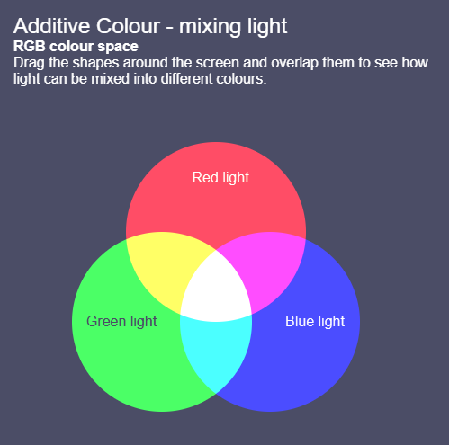
Figure 3.3. Interactive Additive Colour Mixer. Image attribution: Interactive Additive Colour Mixer by Lisa Cianci, Creative Commons licence Attribution-Non-commercial-ShareAlike-4.0
Subtractive Colour
Subtractive colour involves mixing physical materials like paint pigments, printing inks, and dyes. The more colour materials you mix, the darker the colour gets. It’s called ‘subtractive’ because of the absorption or subtraction of certain wavelengths from white light. This absorption is based on how different atoms behave when light hits them. See Chapter 2. Colour theory: the visible spectrum in this resource for more information about the physics and chemistry of colour.
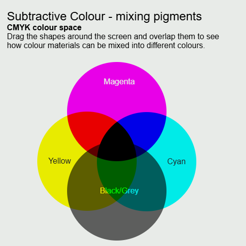
Subtractive primary colours are Cyan, Magenta and Yellow (CMY). The traditional primaries Red, Yellow and Blue (RYB) are also useful to know about in some contexts, like understanding the historical development of colour theory and using older colour wheels. Psychological primaries Red, Yellow, Green and Blue are colours that were once also defined as primary because of historical colour theories about how our eyes perceive colour. See Biology of the human eye for more information about human colour vision and subtractive colour.
A simple example to explain how subtractive colour works
Observe something yellow, like a bowl of lemons with white light shining on it (Figure 3.5). The lemons are reflecting light wavelengths that we perceive as yellow and absorbing all other light wavelengths. We see a yellow colour because its opposite colour – blue (and other similar light wavelengths) is subtracted from the white light. Red and green light when mixed create yellow, so certain amounts of red and green light wavelengths (and other wavelengths between red and green) bounce off the lemons and our eyes see those light wavelengths as yellow.

Figure 3.5. How subtractive colour works by RMIT, licensed under CC BY-NC 4.0 using images by OpenClipart-Vectors and Simona via Pixabay, CC0.
Note: for printing, we use the CMYK colour system. In this system, K represents blacK. Black is used as an extra colour when printing because conventional CMY printer inks don’t blend well enough to create a good black colour. Also, black ink tends to be much cheaper than coloured inks.
More detailed information about subtractive colour can be found in 3.4 Colour systems: printing and 3.5 Colour systems: paint pigments and dyes.
Additive and subtractive colours on the colour wheel
You might observe from the diagram on the previous page that mixing two additive primary colours gives you a subtractive primary colour. You might also observe that mixing two subtractive primary colours gives you an additive primary colour. This can be confusing until you understand how additive and subtractive colour works.
The confusion is at once resolved when it is realized that red, green, and blue are selected as additive primaries because they provide the greatest colour gamut in mixtures. For the same reason, the subtractive primaries are, respectively, red-absorbing (cyan), green-absorbing (magenta), and blue-absorbing (yellow).[1]
Our current scientific knowledge and practical understanding of additive and subtractive colours have led to a more accurate colour wheel that displays both additive and subtractive colours, as shown in Figure 3.6.
Chapter 1. Colour theory: history and culture describes varied theories of primary, secondary and tertiary colours throughout history. This includes some very different examples of colour wheels, including the RYB (Red, Yellow, Blue) colour wheel (Figure 3.7), which is still used in some contexts to teach colour mixing in visual arts.
Here is an image example of a contemporary colour wheel that shows additive primary, secondary and tertiary colours:

Figure 3.6. RGB colour wheel by RMIT, licensed under CC BY-NC 4.0.
And here’s an image of a traditional RYB colour wheel

Figure 3.7. RYB color star (modified to show primary, secondary and tertiary colours), by Kwamikagami via Wikimedia Commons, licensed under CC BY-SA 4.0.
To see an interactive colour wheel with colour relationship options, visit 3.6 Interactive colour wheels and relationships in this resource.
- Encyclopedia Britannica online (Britannica.com), 'The Visible Spectrum' https://www.britannica.com/science/color/The-visible-spectrum
How additive and subtractive colour works when printing a digital image

Figure 3.8. RGB to CMYK conversion flow diagram by RMIT, licensed under CC BY-NC 4.0
When you create a digital image and then print it on paper, this involves a process of converting the additive colour system (RGB colour) in your digital image to a subtractive system (CMYK colour inks) that prints the correct colours onto paper.
Your image editing software or printer software is going through this conversion process, attempting to match what we can see on the digital screen with what will come out of the printer. It’s a complex process, and there are many different automated and manual methods for colour conversion.
More detailed information about subtractive colour and the print process can be found in 3.4 Colour systems: printing. View this page for more about converting images from RGB to CMYK.
Practical activities: mixing additive and subtractive colours
These practical activities can help you to understand how additive and subtractive colour works, and when we use each one to mix colours.
Additive colour activity
You can do some experiments at home with torches and red, green and blue coloured cellophane or transparent coloured plastic or glass to test how additive colour works (you can also do this experiment with red, green and blue LED lights).
If you have red, green and blue cellophane, you can cover three torches – each with different coloured cellophane.
In a darkened room, shine the coloured light from the three torches on a white piece of paper or a white wall so the coloured light overlaps.
What do you see? How many colour combinations can you make?

What happens if you layer two colours of cellophane together – red and green on the one torch, for example?
Does any light shine through the two layers onto the paper? How can you explain this with what you know about additive and subtractive colour? (Hint: the light waves are filtered through one layer of cellophane first, then the other.)
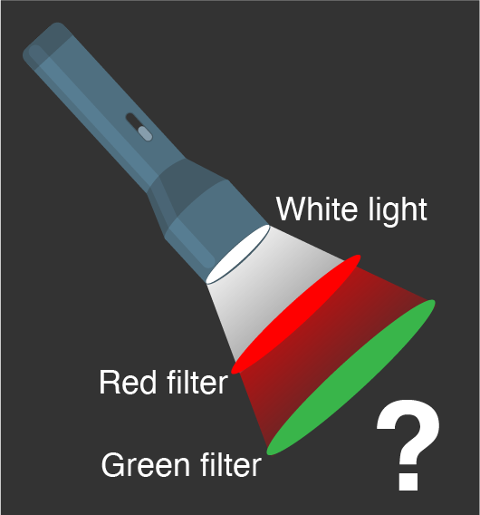
Figure 3.10. Additive colour – two filters on one torch by RMIT, licensed under CC BY-NC 4.0.
Subtractive colour activity
Mix paints, inks or felt-tipped pens of different colours to see how many different colours you can make on white paper. It’s easy to make darker colours with these materials, but how hard is it to make a lighter colour without using white paint or adding water to thin the colour out?
Most cheap sets of felt-tipped pens have cyan, magenta and yellow colours, as well as red, green, blue, black, brown and possibly even grey. What colours can’t be mixed from other colours? There’s more information on mixing subtractive colours in 3.4 Colour systems: pigments and dyes in this resource.

Additive to Subtractive colour activity
If you have a digital editing or drawing software app on a computer, tablet or mobile phone, try and find the colour wheel, colour picker or colour sliders to select different colours to draw or paint with.
See if your app has information about RGB colour, CMYK colour, or other colour systems like Hexadecimal (covered in the next part of this resource – 3.2 Colour systems: digital). If you can print an image from your digital device, compare the colours on the screen to your printed image – how similar are they?
Often the RGB-Red to CMYK-Magenta/Yellow-mix colour conversion is the hardest to get right when printing digital images, although greens and blues can be tricky too, depending on the quality of your printer and printing inks.

Figure 3.12. Colour slider example. Image attribution: Colour slider image from GIMP image manipulation software application, GNU public licence v.3
Test yourself: is it additive colour or subtractive colour?
A multiple choice quiz to test your understanding of colour systems
(5 minutes or less)
View each type of colour application and choose if it’s using additive or subtractive colour systems, or both…
How did you go?
If you need to learn more about this topic, you can read this section again.
3.2: Additive and Subtractive Colour is shared under a CC BY-NC 4.0 license and was authored, remixed, and/or curated by Lisa Cianci.
The book could not be loaded just now.