Opening the book…
A color wheel is a tool that shows the relationships between the primary colors, secondary colors, and tertiary colors. Some wheels also include color properties such as saturation and value. It is useful when mixing pigments for painting and printing.
Isaac Newton
In his 1701 book, Opticks, Newton experimented with the refraction of light through a prism, in which he observed the spectral range of colors. The hues consisted of: red, orange, yellow, green, blue, indigo, and violet. Newton was the first to place hues in a circular arrangement, a format that is still used today. Originally he used only five colors, but later he added orange and indigo to match the number of musical notes in the major scale.

Figure \(\PageIndex{3}\): The original color circle of Sir Isaac Newton with colors added to correspond to contemporary understanding of each hue. (Newton's Color Circle Color by Molly Champlin adapted from Isaac Newton, Public domain, via Wikimedia Commons)
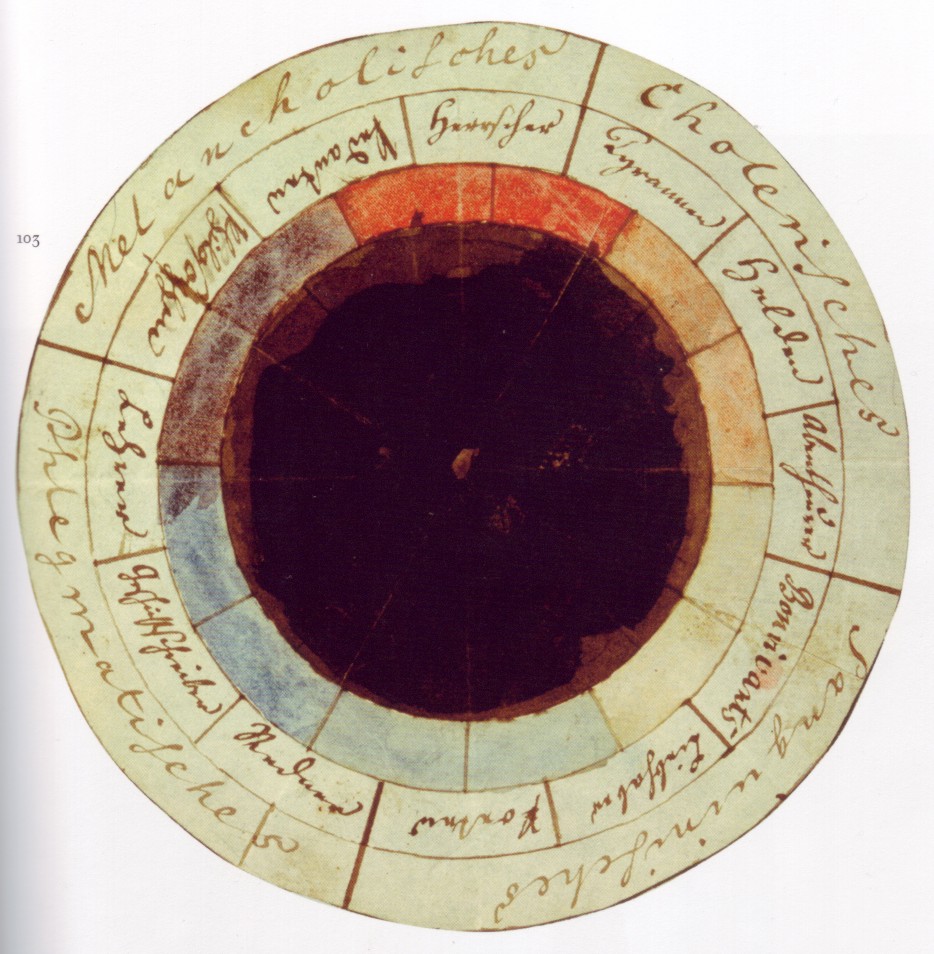
Goethe
Figure \(\PageIndex{4}\): Geothe's color wheel. Colors corresponding to various personality traits…the first mood ring in history. (Johann Wolfgang von Goethe, Friedrich Schiller, Public domain, via Wikimedia Commons)
Color Solids
A three dimensional structure that shows all the colors in a consecutive and interrelated relationship.
Munsell’s Color System 1905
One of the first color-solids, Munsell’s system arranged color by degrees of hue, chroma, and value. It was adopted by the department of agriculture as the official color system for soil analysis and is still in use today in forensics, food, and other fields. Munsell’s Color System includes only 10 colors, five principal hues (R, Y, G, B, P) and five intermediate hues. These hues correspond closely to the optical complements, those complements which combine in light to create white. The shape of munsell's color solid was not a perfect sphere, he compared it more to a tree with longer branches for bright light colors like yellow and heavier at the bottom for bright and dark colors such as violet.
The Ostwald color system
Oswald’s 1916 system was composed of 680 color chips in varying tints, shades, and tones. This system contained four basic hues Red, Yellow, Blue, and Sea Green. Ostwald was invited to give several lectures at the Bauhaus where his color system was in use. While his system was very similar to Munsell's, one major difference was the shape. Ostwald formed his color solid in a more perfect shere, ignoring differences in spectral value between the hues.
The Bauhaus
 Figure \(\PageIndex{6}\): Bauhaus Building. (A.Savin, FAL, via Wikimedia Commons)

The Bauhaus was a German art school operating from 1919-1922. The school strove for a new model of education that would unite the divisions between the fine and the applied arts. The curriculum had a unique combination of modernist, spiritual, utilitarian, and utopian ideals.The movement was very influential for Contemporary Art and Design. Johannes Itten, Paul Klee, Wassily Kandinsky, and Josef Albers (Itten’s former student) taught at the Bauhaus school prior to Nazi closure.
Itten and Albers





Johannes Itten’s 7 color contrasts make up a color theory which embraces the principles of color effects and how they can be applied to design. They form a loose organization system for this class. They are: Hue, Value, Saturation, Complement, Temperature, Simultaneous Contrast and value. With these principles in mind, color can be used to create unique aesthetic experiences which trigger a vast range of associations. The understanding of these 7 contrasts allows an artist to create harmony and/or discord in accordance to the visual experience they wish to provoke.
Another notable figure to have studied and worked at the Bauhaus is Josef Albers. Albers legacy is tied to his painting as well as his years teaching at the Yale University. Published in 1963, Interaction of Color, serves as a handbook or guide for the study of color perception and application. While the text and theory are written by Albers, the visual examples are largely student work from throughout his years of teaching.
Both of these texts will be studied in class and used as guides for our explanation of color theory and principles. They will be augmented with contemporary information regarding digital color, and intersectional theories of color meaning and symbolism.
Bibliography
Albers, Josef. Interaction of Color. Yale University Press, 1963
Itten, Johannes. The Art of Color. Reinhold Publishing Corporation, 1961
Goethe, Johann. Theory of Colours. MIT Press, 1994
Loske, Alexandrea. Color: A Visual History from Newton to Modern Color Matching Guides. Smithsonian Books, 2019
This page titled 1.1: Color Systems was last modified on Tue, 18 Aug 2026 00:49:45 GMT and is shared under a mixed license and was authored, remixed, and/or curated by Lauren Champlin.
The book could not be loaded just now.